Wahaca rebrand: how the Mexican chain has been made to feel like an “independent”
We speak to studio Without on designing a new identity for the chain that harks back to its beginnings as a single street food restaurant in London, despite its growth to 25 branches across the UK.

The UK high-street is in trouble. As more people resort to online shopping, and fewer people go out to eat and drink because of rising rent prices and living costs, shopping and eating out has passed peak popularity.
Chain restaurants particularly, following clothes and electrical stores, have suffered – as more independents and pop-ups emerge, consumers are being offered greater choice, and are becoming more discerning when dining out.
This thriving community of restaurants and cafes offering a more unique experience has left chains such as Jamie’s Italian, Prezzo and Byron Burger in the dark, all of which are reported to have gone into administration this year. It is no surprise that London, with its growing selection of small businesses, has been the worst-hit region in terms of closures, according to business consultant Pricewaterhouse Coopers (PwC).
As independents flourish, it is no surprise that chains are starting to try to mirror their grass-roots look. The same goes for those independents that grow in popularity, which attempt to hang on to their rough-and-ready, start-up persona. Starting out as a pop-up stall in Brixton market in 2008, pizza restaurant Franco Manca now has 40 pizzerias across the UK and Italy – but the restaurant still has a limited food menu, stripped-back interiors and a hand-drawn, illustrated logo.

Mexican street food restaurant chain Wahaca is of a similar ilk. Founded in 2007 by Mark Selby and Masterchef winner Thomasina Miers, the restaurant initially opened one branch in the West End of London, and over the last 10 years has expanded, but still has only 25 branches across the UK, making it a small chain.
The restaurant was founded to shake up how Mexican food is done in the UK, says Miers, replacing “tequila girls, cheap shots and greasy tortilla chips” with “fresh and vibrant” food inspired by real Mexican cuisine.
Now, Wahaca has rebranded by Without with a focus on illustration, in a move that looks to bring it back in line with its roots and reflect the “independent spirit” of its co-founders, says Roly Grant, creative director at the design studio.

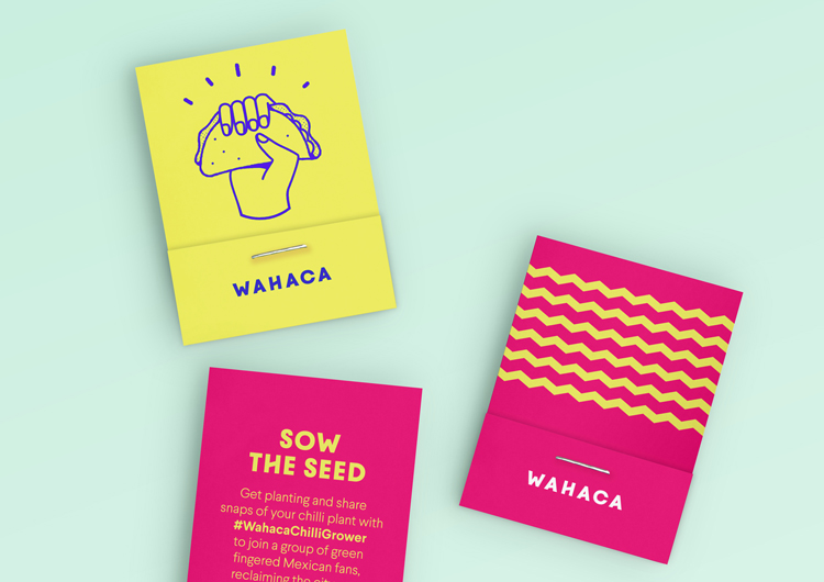
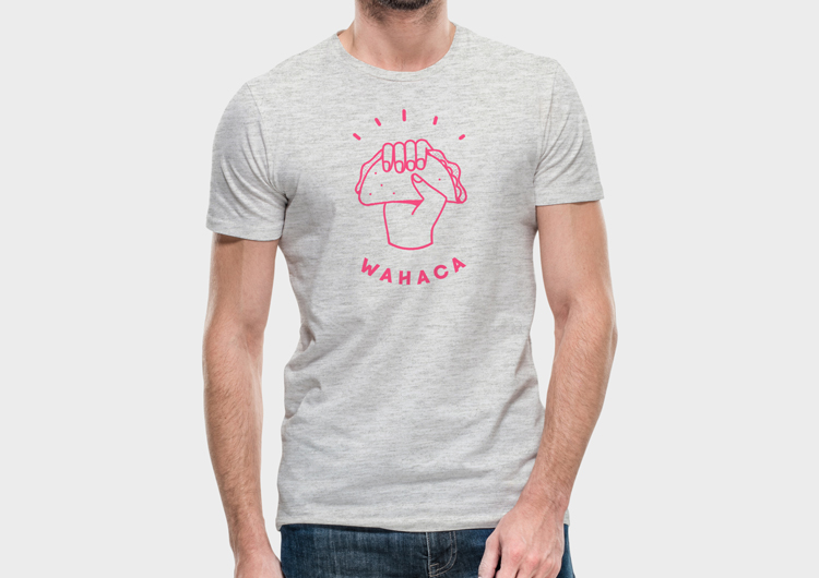
The new branding centres around a line-drawn, illustrated logo of a hand clutching a taco. This takes centre-stage, as the brand-name runs in small, all-capitals, bold sans-serif type underneath it, curved upwards in a semi-circle.
The bespoke sans-serif typeface, Wahaca Bold, also aims to appear “quirky” and “surprising”, says Grant, with angled crossbars used in letters like “H” and “A”.

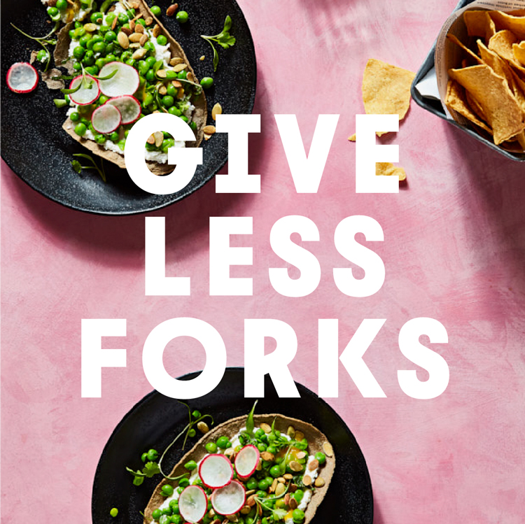
This logo is coupled with a bright colour palette of light pink, bright pink, turquoise, navy and yellow, with the logo appearing in various colours to sit against different backgrounds. A tongue-in-cheek copywriting style has been employed, and collectively, all this playfully looks to indicate a do-it-yourself, light-hearted, start-up persona, says Grant.
Food photography features but graphics and illustration are a much bigger part of the branding, with graphic patterns such as zig-zags and lines incorporated.
Without has worked with Wahaca on its branding since the restaurant launched in 2007, and a colourful, DIY approach has always been part of the restaurant’s look – but the messiness caused by a mish-mash of colours, typefaces and imagery has now been pared-down and simplified into a more coherent brand design system.
“Wahaca isn’t a typical chain in that there is a lot of investment in creativity,” Grant says. “For example, the individuality of each of their restaurants, the experimentation of the menu and the positive sustainable principles they represent. This new work looks to simplify Wahaca’s message, remove elements that add noise rather than value, and emphasise their fresh take on Mexican food.”
He adds that new logo of the hand clutching a taco, surrounded by cartoon-like expression lines, helps to “capture Wahaca’s pioneering spirit”.
“[It says] ‘we love street food’, symbolised by the taco, and ‘we’re informal, because we eat with our hands’,” he says. “Where messages become more nuanced, such as describing dishes, the signature typeface helps keep a branded voice without the need for other distracting elements.”
Since it was founded, Wahaca has publicised itself as a “sustainable” restaurant chain, taking on various projects to help limit its impact on the environment, including reducing energy consumption of its branches, banning plastic straws and sourcing ingredients “locally and responsibly”.
It also attempts to keep its food and dining experience exciting by regularly changing up its menu, and picking interesting venues for its branches, having opened one up in a shipping container on London’s South Bank.
But the chain has also had its share of negative press – a suspected norovirus outbreak in 2016 due to contaminated ingredients allegedly resulted in over 300 diners and members of staff falling ill with the vomiting bug across several branches, causing a significant drop in profits and popularity for the restaurant chain.
While this rebrand could be an attempt to reinvent the brand’s image after this unfortunate event, Grant says that the rebrand has not been a consequence of the outbreak, adding that the business has already “bounced back”, and that this design project is “about the future”.
The restaurant’s co-founder Mark Selby adds that he hopes the new look for Wahaca will help it reach new diners.
“Wahaca has always believed in keeping things fresh and original, and the branding work is really about that,” he says. “The aim is to increase Wahaca’s appeal and spread the word about Mexican food far and wide – we hope it becomes a UK favourite.”
Grant adds that the restaurant initially attracted foodie-types, those with more sophisticated palettes and a general interest in food. Now, as it grows, the brand may be hoping to appear “quirky” and DIY, but also wants to tap into the wider markets of chain restaurants. Perhaps then, Wahaca could start stealing customers from some of the larger, more established chains, such as Prezzo and Jamie’s Italian, that are currently struggling.
“Wahaca’s growth has given us the chance to reach a new set of customers,” says Grant. “Initial fans had been curious and adventurous but [it] has a much wider appeal. Our job was to…capture Wahaca’s pioneering spirit and show that it can be everyone’s favourite.”
The new branding is currently rolling out across menus and print advertising materials, merchandise, interiors and signage in Wahaca’s 25 branches across the UK, and online platforms.


A brand refresh is one thing and yes it looks bright, fresh and inviting but all this harping on about looking ‘independent’ when you are a chain is simply misleading. The restaurants are either one thing or the other not both. It’s a contradiction.