Madhouse puts SUFC rebranding in the net
Sheffield United Football Club unveiled a revamped brand identity last weekend to coincide with the kick-off of the football season and the club’s Saturday opener against Burnley.
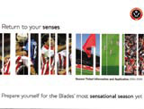
Manchester group Madhouse Associates was responsible for the design, which launched across season tickets and special event and corporate hospitality brochures, posters and flyers.
The consultancy was briefed to create cohesive branding that would still appeal to the first division club’s fan base, says Madhouse managing and creative director Phil Rogerson. ‘The challenge was to produce something flexible to go across all promotions, from football games to Christmas parties. It also had to appeal both to Sheffield United’s fans and to people who aren’t into football at all.’
The ‘clean, bright and fresh’ identity retains the traditional SUFC crest, but now features a band of graphics that can be altered to reflect particular promotions. ‘If [the literature] is about weddings, for instance, we’ll remove any football connotations,’ Rogerson explains.
Madhouse won the initial contract to position the club as Sheffield’s premier corporate hospitality venue last June, without a pitch.
Consultancy creative leads Rogerson and senior designer Peter McCollogh collaborated with freelance photographer Paul Fosbury on the project.
-
Post a comment


