Pearlfisher distills identity for Waitrose gin
Pearlfisher has revamped the graphic identities for Waitrose’s own-label gins, as the supermarket chain tilts them towards younger consumers.
Packaging for the premium and standard London Dry Gins, which launched last week, aims to convey the ‘essence of contemporary London’, says Pearlfisher creative director Shaun Bowen.
‘It builds on what we did last year with Waitrose Spirits and fits into the look that we’re aiming to create across its standard and premium offers,’ he says.
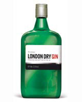
The identity for the standard gin (pictured) reinforces the product’s heritage through an interpretation of a London street sign.
‘The premium London Dry Gin design uses embellished script and silver and white colour cues to promote the product’s [purity],’ says Pearlfisher designer Natalie Chung.
Read this next

-
Post a comment


