To the Point posts new expo logo
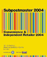
London design consultancy To the Point has scanned in a kaleidoscopic brand identity for this year’s Subpostmaster expo.
The barcode-style marque (right) is inspired by the expo’s key issues of ‘cost and value’ and is easily adaptable for targeting the event’s two audiences, says To the Point group managing director Simon Hutton.
He adds that its vibrant colour scheme reflects a dominant trend in retailing: ‘You only have to walk down [London’s] Oxford Street to see that everyone’s using bold, bright colours,’ he says.
The identity, which was created by Mike Stafford, senior designer at To the Point, is launching across stationery, promotional materials and trade advertising. It will also be applied to ticketing, banners and event advertising.
Read this next

-
Post a comment


