Erotic Review undergoes revamp
The Erotic Review is undergoing its most extensive revamp yet, designed by WHDP creative director Will Harvey, and hits the stands on 21 February.
Harvey will be creative director of the entire project, which includes redesigning the website and advertising material.
The Erotic Review is replacing its Garamond typeface, which is ‘over-used and old-fashioned’ according to Harvey, with Quadraat and Agenda.
‘I want to maintain [the magazine’s] charm and quirkiness and avoid turning it into a lifestyle magazine,’ Harvey says. ‘It is difficult to read and too grey.’
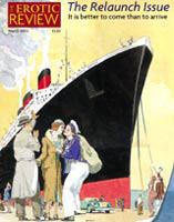
He is introducing more colour and photography and is seeking to raise the standard of illustrations and cartoons. ‘If they are not erotic or funny, they’re not going in,’ he says.
A revamped masthead is being introduced, based on Mantinia and Agenda typefaces, but its existing box-style will remain. Mantinia provides a ‘decadent flourish’ and contrasts with Agenda, which is an ‘elegant, 1930s font’, Harvey says.
The redesign coincides with a shift in direction for the magazine. It is planning to introduce more topical and investigative journalism.
The Erotic Review has recently been bought by its editor, Rowan Pelling, from its previous owner, the Erotic Print Society.
-
Post a comment


