Red Stone updates charity’s logo

Action for Blind People, the third largest charity supporting blind and partially sighted people in the UK, is relaunching its identity, redesigned by Red Stone Design, in April.
The identity will be implemented across three hotels, four employment centres and four residential housing units, which are managed by the charity, as well as a website, literature and stationery.
The consultancy will present concepts for the revamp in two weeks. The charity will manage the redesign of its website in-house.
Red Stone has been briefed to create a clearer, simpler version of the existing marque.
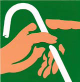
‘We need an identity that better reflects the values and work we do at the charity. The existing identity (pictured) is not representative of what we do as it shows a hand with a white cane. Only about 3 per cent of blind or partially sighted people use a white stick. We also need to look more professional,’ says an Action for Blind People spokesman.
‘We deliver direct services to blind and partially sighted people through hotels, employment centres and residential units, so this [branding exercise] is a big deal,’ he adds.
The identity will be completely overhauled rather than just tweaked, says Red Stone creative director Richard Marshall. The previous identity was designed by The Partners in 1991. Since March 2001 it has used an interim identity, using the words without the visual, which was done in-house?
‘It will be completely different. There is a minimum typesize agreement, which will need to be enforced,’ says Marshall.
The consultancy won the work at the end of January, following a five-way creative pitch.
-
Post a comment


