Sekonda watches out for a new look by Pentagram
Watch brand Sekonda is undergoing the most significant rebrand in its 40-year history, with a revamped identity by Pentagram.
The identity will be introduced to packaging, products and print and marketing material over the next few weeks.
Pentagram partner David Hillman was approached for the work on the strength of the identity he created in 1999 for Marcus, a luxury watch store in London’s New Bond Street owned by Sekonda parent Time Products.
‘It is a total overhaul of the brand as Sekonda did not have a particularly strong identity,’ Hillman says. ‘A chrome-style logo had been used inconsistently [in the past].’
‘Pentagram showed us how to turn a name and logo into a proper identity,’ says Sekonda managing director Julian Pollock. It will be unveiled prior to a ‘lot of marketing activity’ over the next 24 months.
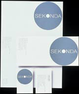
Hillman was briefed to better reflect Sekonda’s core values in a ‘fresh, contemporary’ way. The marque comprises a new logotype featuring a simple sans serif typeface set horizontally against a circular ground, alluding to a watch face, Hillman says.
The central ‘O’ in solid type recalls the pivotal point of the watch hands, which are subtly formed from the remaining six letters in the name.
Sekonda’s identity will be applied to point-of-sale merchandise and in-store displays as well as products and packaging. ‘It will be applied mainly to packaging and collateral as it is difficult to apply a circular logo to a round watch face,’ Pollock says.
Pentagram was briefed to create an identity for Sekonda that would work across all different media, he adds.
The consultancy will continue to work with Sekonda on several projects related to its image and identity, details of which are still under wraps, Pollock says.
Read this next

-
Post a comment


