Breast Cancer Now – the “first major new charity brand of the century”
The Clearing has branded the new organisation, formed from a merger between Breakthrough Breast Cancer and Breast Cancer Campaign.

The Clearing has created the identity for new charity Breast Cancer Now, which has been formed from a merger of Breast Cancer Campaign and Breakthrough Breast Cancer.
The Clearing creative director Jonathan Hubbard says that part of the brief for the new identity was to create “the first major new charity brand of the 21st century”.
The newly formed organisation is the largest breast cancer charity in the UK and is launching with the aim of stopping women dying from breast cancer by 2050.
The Clearing was appointed to develop the branding for the new charity at the start of the year.
The previous Breakthrough Breast Cancer identity was created by Hat-trick in 2009, while the Breast Cancer Campaign branding was developed in 2013 by Vincent Design and Identica’s Chris Cleaver.
Hubbard says: “Both previous charities had very strong identities. We wanted to make sure this felt like a new charity.”
The consultancy worked with around 60 stakeholders from both previous charities, says Hubbard, who adds: “We had a really clear deadline, which really focused everyone.”
“Pink was a challenge for us”
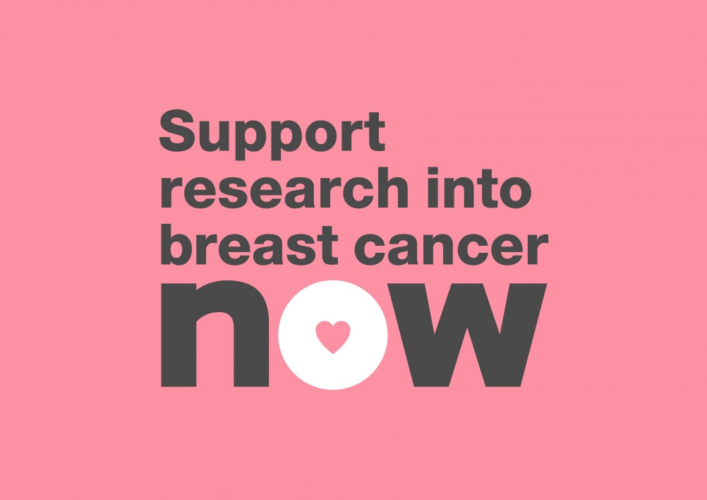
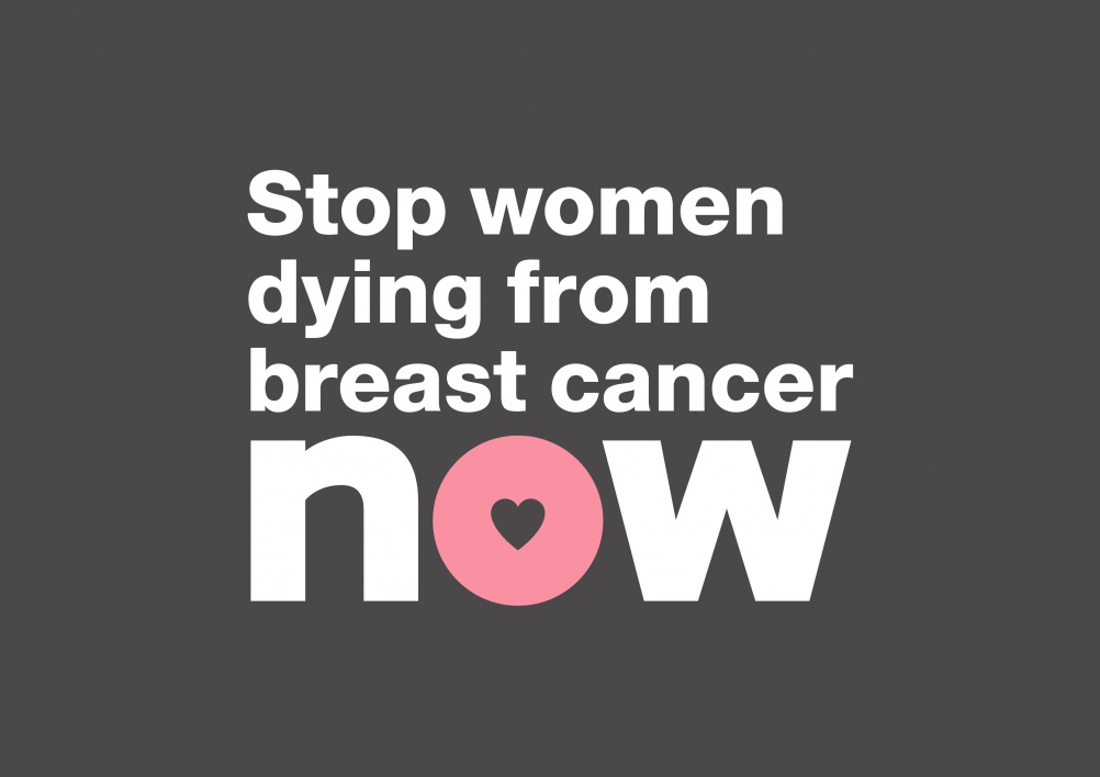
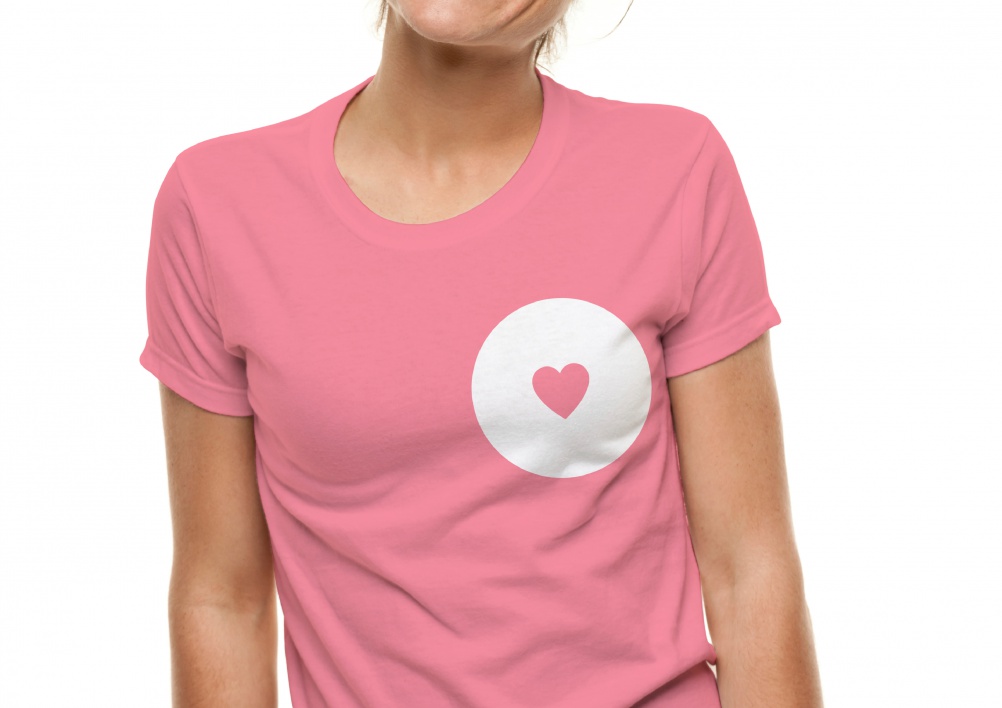
The new Breast Cancer Now identity uses a pink and grey colour palette, while the logo features a heart inside a circle.
Hubbard says: “The pink was a challenge for us. Breast cancer charities effectively own pink and there are 53 charities in the sector, many of whom are using the colour.
“But we wanted to own the cause of stopping breast cancer. If we didn’t use pink in the identity then the charity would have to spend the first ten minutes of every conversation explaining why they weren’t pink.”
Hubbard says the identity uses a “more human, more natural and softer” pink colour, in contrast to the “quite plastic” magentas used elsewhere in the sector.
He says: “To balance the softer pink we’ve used a harsher grey. This also allows us to talk about things like hope and fear.”
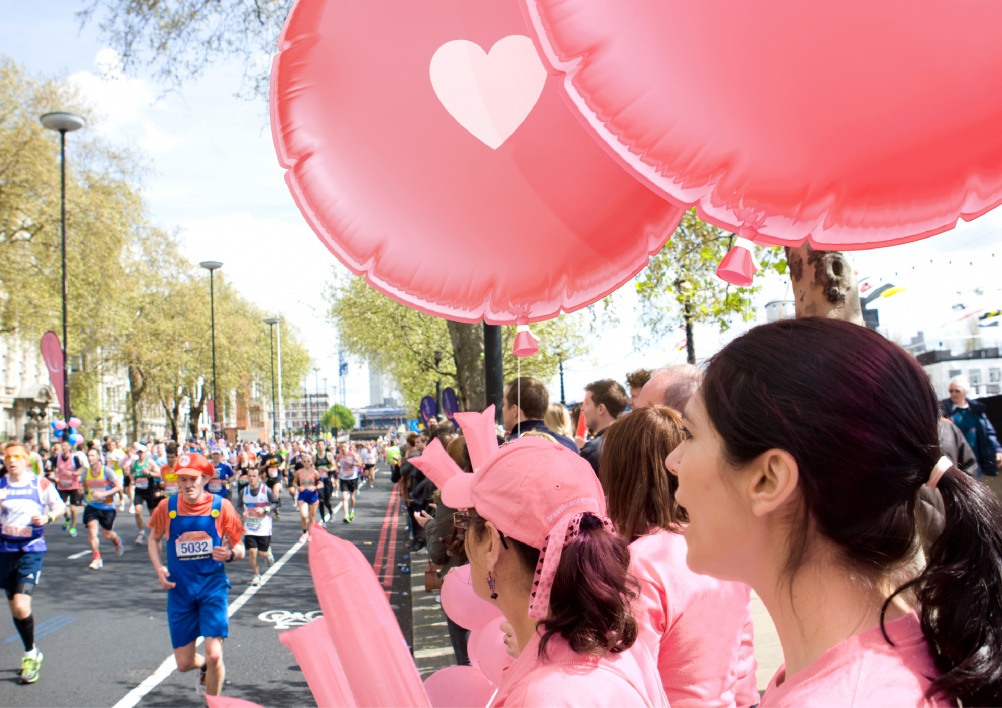
Creating “a symbol that people could treat as their own”
Hubbard says the identity has been designed “as a symbol that people could treat as their own.”
Charity supporters will be able to use the identity in any way they wish, says Hubbard. He adds: “We wanted to make sure there were no harsh boundaries to it.”
Hubbard says the heart also represents “the fact that nearly every person who is contributing to the organisation is doing it because of the memory of or love of someone”.
The name Breast Cancer Now references the charity’s aim of stopping women dying from breast cancer by 2050, says Hubbard. He says that it can be “used as part of the cause” by being integrated into messages such as “stop women dying from breast cancer now”.

Read this next

-
Post a comment


