Brand Union works with digital charity Kiteka to “empower Ugandan women”
The design consultancy has created the name and brand strategy for Kiteka, which is a new start-up providing smartphones to female entrepreneurs in Sub-Saharan Africa.

Brand Union has designed the visual identity for a new charity start-up looking to empower women in Uganda through giving them access to smartphones.
Kiteka – which has been founded by Hephzi Pemberton – will give female, small business owners and entrepreneurs in the country smartphones to further their work, alongside training and mentorship.
“Bridge the gender gap in technology”
Sony Z3 smartphones will be purchased by the charity in Uganda, then 10 distributed to local women monthly. Group training will then be provided monthly, alongside online video tutorials and updates sent to participating women through a WhatsApp group.
The project aims to “help bridge the gender gap in access to technology” in developing countries in Africa, says Pemberton, and “help more female entrepreneurs become active members of the digital economy”. Currently, women are 23% less likely than men to own a phone in Sub-Saharan Africa, according to Pemberton.
The aim is for Kiteka to expand to other English-speaking countries in Sub-Saharan Africa, and provide over 500 women with smartphones.
Part of UN’s Common Ground initiative
Brand Union, which is owned by parent company WPP, got involved in the project as part of Common Ground; an initiative which has seen the six largest marketing and advertising groups across the world address the UN’s Sustainable Development Goals (SDGs).
These goals include clean water and sanitation, reducing poverty, good health and quality education. WPP is looking to tackle gender inequality.
Brand Union renamed the charity, which was initially known as 100 Phones, and developed its brand strategy and visual identity.
The name Kiteka has been inspired by Earth Goddess Kitaka, taken from Ugandan mythology, combined with the word “tech” to emphasise the idea of empowering women through technology, say Brand Union lead designer Chris Beck.
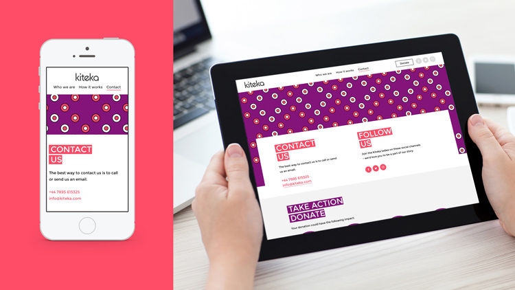
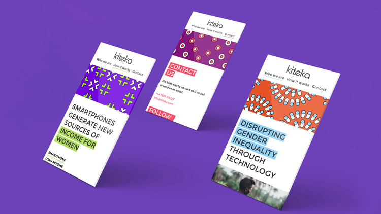
A bright colour palette and various textile-influenced patterns have been used, which reference African fabrics and dresses. Brand Union chose these patterns and colours based on WhatsApp conversations with the Ugandan women involved in the charity.

A primary, lowercase, sans-serif typeface Cera has been used for the logo, with a secondary, uppercase, sans-serif typeface Montserat used across communications, which was “clean, simple and free”, says Beck, which was a consideration given the small-scale size of the charity.

Ugandan cultural elements have been paired with visual cues inspired by digital platforms, and user interfaces (UI). This includes a highlighting tool used over text, which mimics the predictive text function on WhatsApp that highlights words as you begin typing them.

The patterns used mimic digital buttons, such as the “on/off” slider found on a smartphone, the full-screen expansion button and the circular selection box found on online questionnaires.
“We tried to find a unique style that was a contemporary interpretation of African visual cues,” says Beck. “We then tried to link this to the fact that it’s a tech company.”
The idea of gender equality has been reiterated through the photography used and the tone of voice, adds Beck. The Ugandan women took “selfies” of themselves, which were then shared with Brand Union via Whatsapp, and used across the campaign, while the language aims to be “short and snappy”. “The smartphone empowers them to take photos of themselves, and take part in the initiative,” says Beck.
Kiteka has launched this week, and the new branding will begin rolling out across online platforms, including the website and social media, this month. It will also be used across internal marketing and presentations.


-
Post a comment


