Baxter and Bailey designs student recruitment campaign for Abbey Road Institute
Familiar symbols of music production such as play, pause and fast-forward were used alongside photographs of current students to create an “active” look.

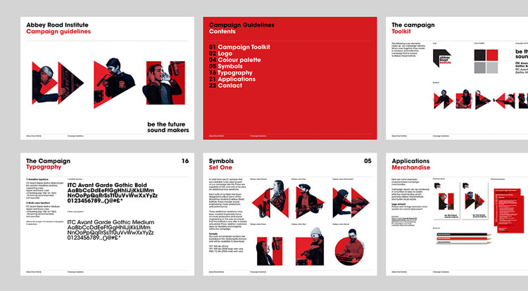
Baxter and Bailey has created a student recruitment campaign identity for Abbey Road Institute which aims to spark interest with potential applicants.
The Institute describes itself as a “training ground for the next generation of music producers and sound engineers”, offering “hands-on” courses which set out to prepare students for a career in the music industry.
The design studio has created a series of visual elements to be used across digital and print, drawing on the existing logo of the music production school, which was created by Form.
The new campaign by Baxter and Bailey centres around a central concept and tagline: “Be the future sound makers”.
A system of familiar icons from the world of music production have been used across the campaign.

Symbols for play, pause, rewind and fast-forward, in red, were overlaid with black and white photograph cut-outs of existing ARI students making music, taken by Alys Tomlinson. The images were set on a white background.
Matt Baxter, creative director at Baxter and Bailey, says: “We wanted to give a bit of a sense of the human element.
“It can be quite useful to show people in a campaign like this for [future] students who want some insight on what the course might be like, so to go with an entirely cold, graphic-only approach wouldn’t have been right.
“It needed to feel active, like it wasn’t just theoretical, but you would be there in studios using equipment.”
The Institute was “born out of the expertise and skills developed at the [Abbey Road] Studios over the past 80 years”, according to the music school.

But for the new campaign, Baxter says it was important to “not just rely on the heritage and history” and to help the Institute “begin to form its own identity”.
A lot of what is taught on the curriculum, which includes production techniques and topics on the businesses of music, is “very contemporary”, he explains.
“It is sate of the art teaching, so to rely entirely on heritage to communicate something ultra-modern is not really right,” Baxter says. “It needed to feel a bit more forward-looking.”
The studio has followed the existing red, black and white colour palette found in the visual identity.
“It helps to keep it strong and memorable and keep the consistency across different touchpoints,” Baxter adds. “So if you see a GIF on Instagram or a banner on Facebook there is a strong consistency between those elements.”

A toolkit for digital and print elements has been created for the campaign by the studio, along with some initial roll out assets including animations to use online, for social media and digital advertising.
It has also provided rules on merchandising, with examples of how the campaign could be applied to items such as tote bags, stationary and T-shirts.
The Avant Garde typeface is used throughout the campaign, drawing on brand identity guidelines for Abbey Road Studios originally designed by Form design studio, which specify this as the primary typeface for the Studios.
As an additional standalone item, Baxter and Bailey has also made a tuning fork to be given to graduating students.


Read this next

-
Post a comment


