Lead the way
As the most conspicuous part of a building’s wayfinding system, signs have to look good and work well, but they now also have a significant role to play in branding.
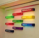
The Institute of Contemporary Arts, London
Designer: Milk Communications
Milk Communications is not an obvious choice to design a signs package for an arts institution. Established four years ago by ex-Wieden and Kennedy senior strategic creative Steve Turner, the creative agency turns its hand to advertising, film and design – whatever medium is appropriate for the message – but had never before taken on signs.
However, the team at London’s Institute of Contemporary Arts saw Milk’s work and initially approached the group to tackle what it perceived to be both an external and an internal signs problem.
Certainly, the ICA does not shout its presence on The Mall – but planning restrictions mean that it is unable to do anything other than the current discreet sign at its entrance. Milk therefore turned the focus of the brief to the interior. Here, the problems were two-fold – a difficult layout that did not encourage visitors to explore the upstairs gallery or discover the tucked-away cafe and bar, and the accretion of various bits of temporary signs and posters in the main foyer.
Milk had a daunting brief, considering the previous signage situation. ‘If you just went into the [ground floor] exhibition, there’d be nothing but perhaps an bit of A4 paper to tell you to go upstairs,’ says Turner. ‘We wanted to create something that catches your eye as soon as you arrive.’
Milk’s first idea proposed real-time TV screens in the foyer showing the bar, café, digital media room, cinema and galleries to show visitors what else was going on in the institute. This scheme was ruled out on cost grounds, so the consultancy came up with a basic colour-coded menu on the main reception wall in an arrangement of individual, illuminated boxes, graduated in size to give a sense of moving through space. Each was handmade from a semi-opaque resin with laser-cut typography and strip-lit. Colours are either historic – the digital media suite was traditionally a 1960s green, which Milk used for the menu sign – or dictated by the mood of the space and proximity to the next sign. Each space is labelled with its own sign, with signs indicating the facilities down the long corridor leading to the bar, café and upstairs gallery.
Milk is not wholly satisfied with the result and has its doubts about the wisdom of adding another layer to the higgledy-piggledy building, rather than stripping back what was already there.
‘The challenge was more interesting than the final result,’ says Turner. ‘It was a fantastic learning curve, but there’s so much more potential for signs as 3D branding devices.’
Read this next

-
Post a comment


