Social Mobility Foundation gets a moving brand identity
Jones Knowles Ritchie has rebranded the charity — which helps young people from disadvantaged backgrounds get into their dream careers — with a playful, animated “o” symbol that “climbs the career ladder” as it jumps up the logo.

Studio Jones Knowles Ritchie has rebranded charity the Social Mobility Foundation, giving it an identity with an animated “o” symbol which metaphorically climbs a ladder to success.
The Social Mobility Foundation is a careers charity that works with young people aged 16 and 17 from low-income and minority backgrounds, to help them get into top universities and the careers that they want.
Jones Knowles Ritchie has completed the project for free, as part of its charitable branch the JKR Foundation, which was set up in 2017 and works on pro-bono design briefs for a few charities every year.

The rebrand was completed in roughly three months, and came about from a relationship with the charity, as the design consultancy’s global CEO Guy Lambert is a mentor at the Social Mobility Foundation.
The new identity looks to unify many different identities used across marketing communications, made up of varying colour palettes, typefaces and brandmarks, says Sean Thomas, executive creative director at Jones Knowles Ritchie.

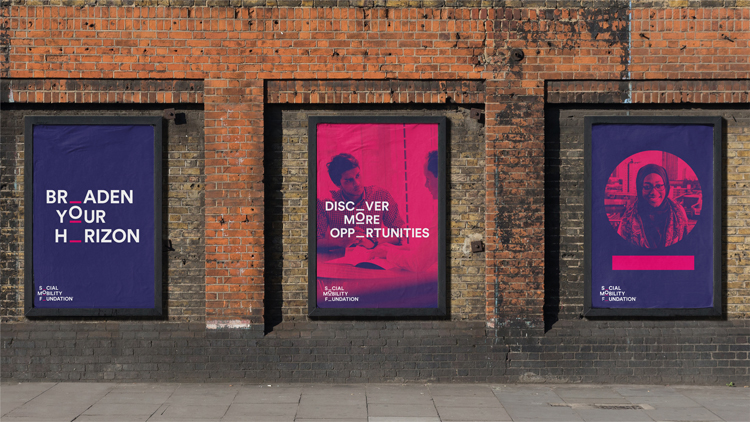
The new branding is animated, made up of the charity name set in a sans-serif, all-caps typeface, with the first “o” letter of each word missing. A moving “o” then “climbs the ranks” up the logo, says Thomas.
The concept aims to symbolise the idea of climbing the career ladder, and has an “upward momentum”, while adding “playfulness and motion” to the logo.
This “missing ‘o’” concept has been used more widely across copy on posters, merchandise and welcome booklets, removing the ‘o’ letters from various words and phrases to reinforce the identity. The studio had to take care to only remove the “o” out of words that would then still be easy to read, such as where there were two consonants either side of the “o”, says Thomas.
“The biggest challenge was producing the static version of the animated logo,” says Thomas. “We checked with over 30 people internally about whether they could read the logo, and body copy, with the ‘o’ missing. We found that as long as there wasn’t a vowel next to the ‘o’ that created another word, then it was fine.”

The brand’s former primary colour palette of pink, purple and white has been retained with slightly brightened shades, to retain resonance with the organisation. The left alignment of the logo has been kept for the same reason.
Free typeface Avenir, which is available on Apple and Microsoft operating systems, has been used for all body copy across the new brand, to keep costs down for the charity and enable its in-house creative team to produce marketing materials such as leaflets in keeping with the brand identity. In terms of imagery, the studio has worked with the charity’s existing photography.
Jones Knowles Ritchie aimed to target two core audiences with the rebrand – young people and commercial investors, who provide the charity with funding.
“Online is a big channel for the charity, so we felt there was an opportunity for the branding to move,” says Thomas. “That’s where this idea of the ‘o’ moving up through the hierarchy of society and business came from.
“We hoped this would be a little spark of wit that would appear to the charity’s core audience of young people, and otherwise it was just smartening the brand up and making it more consistent to make it look more credible and slick for investors.”
The design studio has provided the Social Mobility Foundation with brand guidelines including colour palettes, typefaces and imagery use, which also includes predefined filters for photography and guidelines on how to produce effective hero imagery.
“This project was a pure design task rather than changing the charity’s mission or purpose,” says Thomas. “It was about giving it credibility and consistency. They do a lot of in-house communications so our job was to unify the messaging to give it one voice, rather than lots of separate initiatives.”
The Social Mobility Foundation’s new branding has now rolled out across all touchpoints including print communications, online platforms such as the website and social media, and merchandise.

-
Post a comment


