
Seymourpowell rebrands cult canned drink Nurishment for broader audience
The new look for the milk-based drink includes a “decluttered” visual identity, an updated packaging format and a focus on taste.
Seymourpowell has designed the new identity and packaging for fortified milk-based drink brand Nurishment, in a bid to appeal to a wider contemporary audience.
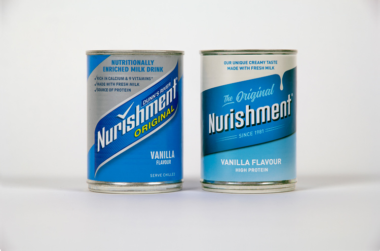
Launched in 1981, the protein-rich drink was initially intended as a “handy pick-me-up”. Recognisable for its ring-pull can packaging, it quickly became “corner shop favourite for neighbourhoods across the UK”, the company says.
Four decades of the brand has led to a “cult following” according to Seymourpowell, which was invited to pitch for the work by Grace Foods, Nurishment’s parent company. The main aim of the project was to appeal to both new and old fans.
Taste over nutrition
Prior to Seymourpowell’s involvement with Nurishment, rhetoric surrounding the brand focused on the nutritional benefits of the drink, the studio says. In this new iteration, the focus has been shifted.
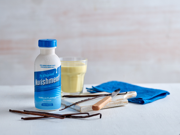
“[We] felt that the emphasis should be placed on the product’s true unique quality: its taste,” says Seymourpowell senior design strategist Dave Ralph.
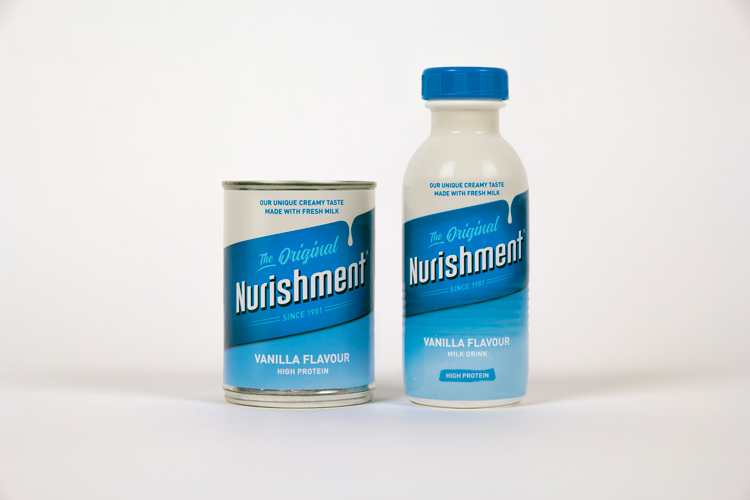
Copy throughout the brand pertaining to the drink’s nutritional qualities, including on pack, has therefore been simplified and signals for taste have been emphasised. These include the introduction of a consistent “cream” at the top of the label and the creation of an “ownable ‘drip’” graphic.

“Simplify and modernise the nostalgic visual elements”
The decision to simplify copy forms part of a wider “decluttering” mission by the studio. While the blue brand colour has been retained and “enriched”, the rest of the identity elements have been “subtly changed”, according to Ralph.
“It was a balance between keeping iconic elements and creating new assets, like the new bottle, which felt as distinctive and ownable for the brand as the original can,” Ralph tells Design Week. “Our strategy here was to simplify and modernise the nostalgic visual elements that have made Nurishment so endeared.”
The wordmark, for example, has been redrawn in a softer typeface, and is accompanied by “The Original” in an attempt to highlight the brand’s history.
For better legibility and so that, as Ralph says, “not just those that are already familiar with it” can understand the brand, the angle of the lozenge graphic displaying the Nurishment name has been reduced.
A new packaging solution for new consumers
While the Nurishment tin can is one of the most recognisable elements of the brand, in their research for the project the studio says it found this format could be a “barrier” for some prospective drinkers.
For this reason, time was also taken to develop an alternative bottle packaging – the first in the brand’s history. This convenience puts it in the same playing field as other modern drinks on the market emphasising protein content and nutrients.
A “bold simplicity” has been employed for the “easy drinking” bottle format’s labelling, so as not to overshadow the original tin can while still feeling approachable for newer consumers.
As for the shape of the bottle itself, Ralph explains Seymourpowell’s structural design team drew inspiration for it from the traditional form of a milk churn.
“[This alludes] to the product’s provenance and the unique creamy taste that is so distinctive and only possible with the use of fresh milk,” he says.

Read this next


So, that’s decluttering is it?
It looks like the plastic bottle (plastic!) is covered in that film that makes it difficult to recycle.
Why are we still doing this? It’s 2020.
Looks terrible.
And seriously, “The wordmark, for example, has been redrawn in a softer typeface, and is accompanied by ‘The Original’ in an attempt to highlight the brand’s history”? If you have to explain that hard, it’s not working
Awful!
This is what happens when a very good product design company get greedy and try to expand into branding and digital. They get projects on the back of their strong structural packaging portfolio and then creating piss poor branding because they haven’t invested enough to get the right level of skillset in.
Stick to what you’re good at and leave branding to the professionals.
The most boring, uninspiring powerpoint designed design job I have ever seen. Even the bananas in the photos look more interesting than the brand.