Sky Sports looks to become “ultimate storyteller” with rebrand
Sky Creative and Nomad have created a new identity for the sports broadcaster as it expands its service to include 10 individual channels.
Sky Sports has revealed the biggest change to its branding in its 26-year history, as the sports broadcaster expands its offering for customers.
The rebrand has been carried out as part of a seven-month collaborative project between Sky’s in-house design team Sky Creative and London-based studio Nomad.
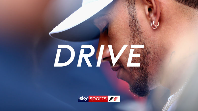
A new visual identity has launched to coincide with the broadcaster expanding its service to include 10 sports channels, including dedicated channels for the Premier League, football, cricket, golf and Formula One (F1).
The rebrand looks to position Sky Sports as the “ultimate sports storyteller”, says Nomad, moving beyond “cliched celebratory moments” in sport and showing the “grit, pain, passion and disappointments”.
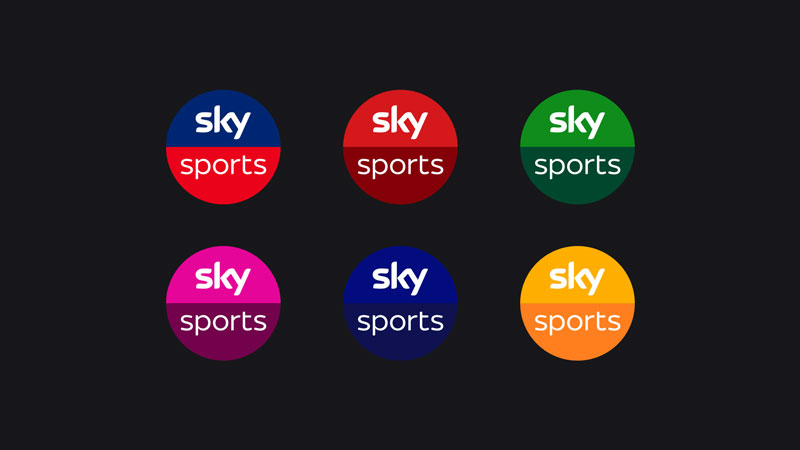
Refined logo
A more refined logo has been introduced, which was designed in collaboration with typographer Miles Newlyn and sees the uppercase font from the previous branding swapped out for a simpler, lowercase one.
The identity for each channel is based on new, overall brand guidelines encompassing bespoke typography, tone-of-voice, sound design, hero photography and set design.
However, all of the channel identities are allowed to “flex and stretch” to express their unique personalities, such as “raw and technical” for F1, “focus and precision” for golf and “atmospheric and iconic” for Premier League.
The new identity has now rolled out across all touchpoints.


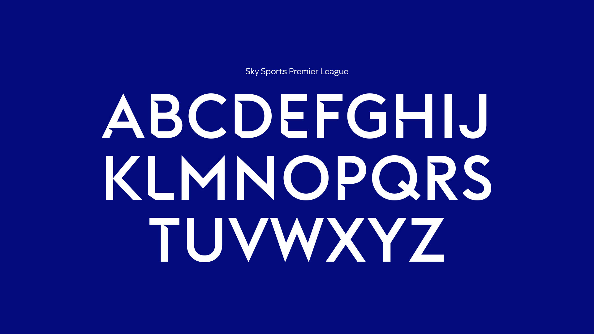


font name premier league?