Altered images
Since becoming head of commercial photography, Europe, at Corbis, David Harrigan has brought a fresh look to the company. Sara Manuelli reports

David Harrigan’s CV
January 2002-present Director of commercial photography, Europe, at Corbis
January 2001-January 2002 Head of art at Getty Images
September 2000-January 2001 Senior art director at Stone/Getty Images
January 1998-June 2000 Editor at Speedo Internet
May 1995-January 1998 Editor/Web producer at Designercity; editor/producer of Le Shuttle website; editor/producer of DC Nat Mags website
December 1993-September 1994 Fashion director at Attitude magazine
January 1991-December 1993 London style correspondent at Mondo Uomo magazine in Milan
January 1989-January 1991 Fashion and editorial assistant at For Him Magazine (now FHM)
Hiring a castle in the Dordogne or jetting off to South Africa for a shoot is probably everybody’s idea of a dream job, but David Harrigan has managed to turn it into a reality.
Not that he’s not working hard. Appointed as Corbis director of commercial photography, Europe, exactly a year ago, Harrigan has been tasked with developing a strategy to build a commercial collection of images that represent European styles and trends for the UK, European and other markets. In practical terms this has meant completely restructuring the relationship with photographers and allowing fresh talent to breathe new life into the images.
Harrigan likens his task at Corbis to that of working on a blank canvas. ‘It helped,’ he says, ‘that there was no preconceived idea of what Corbis is. For many it’s a huge library with loads of images, some of which are really commercial, others more editorial.
‘Because there’s a lack of awareness, it seemed to me there was a lot of scope for development. It was the perfect opportunity for me, my photographers and the business to take the time to identify what we represent.’
With a background as head of art at Getty Images and before that writing and editing within the fashion industry, Harrigan prides himself on cherishing close relationships with photographers, something he has brought over to Corbis. He looked at the heritage and the weaknesses of the company and went through a restructure, implementing a strict regime on selecting what was submitted, editing down the work and rejecting almost 99 per cent of the shots.
Harrigan deals with all the photography coming into Corbis’ London, Paris and Düsseldorf offices. Regardless of the sheer quantity of images produced by his collaborators, he has managed to keep it personal.
‘The essential element I introduced was the feedback with the photographers,’ he says. This not only allows Corbis to achieve the best from its photographers, but also creates relationships that may go beyond the monetary exchange. It’s not unheard of, for example, for Harrigan to give photographers the chance to pursue their less ‘commercial’ interests, such as a period of field work in Lithuania or the mid-West, or inviting them on scheduled photoshoots to ‘do their own thing’.
What Harrigan gets out of it is not only the odd sellable photo, but the skills of a photographer who’s creatively inspired. ‘The photographer isn’t a commodity,’ he says.
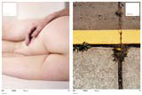
With this attitude in mind, Harrigan has worked hard over the past year to produce the new catalogue Crop, an outsized mixed paper stock affair with lavish and striking photography. Crop, which will be on most ad agencies and art directors’ desks over the next couple of weeks, smacks more of photo gallery promotional literature than the conventional photolibrary marketing approach.
Visually, Crop is Harrigan’s proof of the quantum leap that has happened within Corbis. ‘The change from 11 months ago to now is huge,’ he says. Designed by Chicago-based Carlos Segura of design group Segura, which has also created a new identity for the company, it nevertheless manages to cover all Corbis’ various divisions, including its celebrity, fine art and historical archives.
Yet Harrigan doesn’t want to place Corbis on the ultra fashionable level. Asked how he would differentiate the photolibrary from, say, its main rival Getty, Harrigan has a prompt reply. ‘We’re different from a visual point of view. We promote a series of images, which are immediately readable, clear and concise. There’s no room for a very fashionable image – we’re not trying to pre-empt the market, providing an image before the vendor wants it. We’d rather go for an image that has a global appeal.’ He also underlines the different brand and different client base.
Having said this, Harrigan doesn’t want to lose sight of anything that might help to improve the business. To achieve this, he has just taken on a new person at his research centre who will monitor trends and needs.
According to Harrigan, if more adventurous – and award-winning – ad agencies such as Mother aren’t yet Corbis’ clients, this is only a matter of time.
-
Post a comment


