Free doesn’t have to look cheap
The press heavyweights will soon be fighting for London’s free paper market. Clare Goff thinks design could be a useful tool in their arsenal
The press heavyweights will soon be fighting for London’s free paper market. Clare Goff thinks design could be a useful tool in their arsenal
Next month the streets of London will become the stage for a bloody battle between the UK’s most competitive newspaper publishers. Associated Newspapers, owner of the Daily Mail, Evening Standard and Metro, will be pitched against News International, publisher of The Sun, The Times, and – from 18 September – the UK’s latest entry into the free newspaper market, The London Paper.
The London Paper will go head-to-head with the Evening Standard and will be hand-distributed at points across the capital, targeting commuters on their way home. Associated is believed to be planning to swamp the transport networks with its own free daily Standard Lite and the media industry is buying up front row seats in the most ferocious battle in newspaper history.
One of the weapons News International is drawing on in its bid to dent the Evening Standard’s long monopoly over the London evening market is design. Having poached art director Alfredo Trivino from Metro International (publisher of free newspapers across the world, but no relation to the London Metro), it is promising to move the design of free newspapers to a new level.
Although still under wraps, the paper’s design has been influenced by the European market and by the medium most responsible for the decline in newspaper readership: the Internet. And, unlike other papers in the market, Trivino says The London Paper will, for the first time, be designed with the peculiarities of the free market in mind. ‘Free papers in the last ten years have been designed along the lines of paid-for titles,’ he says.
With their ‘boxy mastheads’, cluttered pages and ‘too much blue’, the free newspaper market has been formulaic and conventional in its use of design, says Pentagram partner David Hillman, and, as such, is missing a trick. ‘They don’t need to leap off the shelves or conform to the rules and regulations of the paid-for market,’ he says. ‘They are the underground papers of the 21st century, but they look like bad versions of the Daily Mail.’
Aimed at a trapped audience ‘who would read recipe cards if you gave them to them’, Hillman says that free papers have failed to capitalise on their freedom in design terms.
‘They look exactly as you would expect them to look – throwaway-able,’ says Mike Dempsey, founding partner of CDT Design, who says there is little differentiation in the market.
While free newspapers do not need to convince readers to buy them, they do need to convince advertisers – their only source of revenue – to use them, and this is seen as a key reason for their lack of imagination in design terms. Hillman would like to see free newspaper publishers sit down with advertisers and come up with a new way to incorporate ads within their pages that doesn’t compromise design.
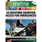
The London Paper is to attempt this and has created a new page template aimed at ‘neutralising the impact of ad density ratio’, says Trivino. With an ad-to-editorial ratio of around 35-40 per cent and 40 pages each day, the paper will be designed to avoid the ‘busy-ness’ of too many ads. As competition hots up, design is expected to improve. Metro UK would not comment on any future plans for its design, but it will be watching developments closely. The paper has been updated a few times over the course of its seven-year history and is designed as a ’20-minute read’, according to a spokesman. ‘It’s a very clean design that allows it to be read quickly and easily in the morning,’ he says.
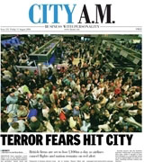
City AM – the newest title in the London market – was the brainchild of two ex-Metro International executives and the brief for its initial design was to create an elegant, European look, says art director Colin Wilson.
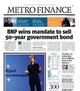
Metro International, the original free newspaper company that now publishes in 93 cities across the world, is preparing for a redesign this autumn, in response to new competition. Before joining News International, Trivino worked on a new look for the paper. He says that the redesign will appeal to a younger age group and will be more focused on the locality in which it is published.
‘Metro International is a global brand and is fantastic for ads, but editorially it needs to be localised to take into account the differing newspaper traditions,’ says Trivino. Sweden, the paper’s birthplace, has a tradition of newspapers being ‘very busy and funny’. ‘To do that in a New York paper is crazy,’ he explains. Making strong use of pictures and with a much cleaner look, the title looks set to lead an overhaul of design across the market.
Mario Garcia, founder of Garcia Media, has designed newspapers across the world and says that free papers are now moving into their third phase. ‘They began as a very basic generic design, aiming for commuters in a hurry; in their second phase they became slightly more sophisticated visually,’ he says. Garcia is noting increased sophisticated and more opinion pages. ‘We are likely to see truly classic designs in the future,’ he predicts.
London ‘frees’
Metro UK: More than 1 million copies are distributed at key transport links across 15 cities in the UK, targeting commuters on their way to work
The London Paper: Launches on 18 September with a circulation of 400 000, distributed by 700 people in central London and Canary Wharf between 4.30pm and 7.30pm
Standard Lite: Associated Newspapers’ free Standard spin-off, with a female bias; 78 000 copies are distributed at lunchtimes across London
City AM: First financial freebie in the UK, launched last year; handed out at key business points across London and read by more than 100 000 professionals
-
Post a comment


