Pentagram partners give Garden Museum abstract new look
Luke Powell and Jody Hudson-Powell have worked on the new identity system, which has been designed to help the museum attract a broader new audience.

Pentagram partners Luke Powell and Jody Hudson-Powell have created a new identity system for the Garden Museum, which reopened in Lambeth, South London in May following a two-year refurbishment.
The new identity is designed to reflect the museum’s mission to become an open and inclusive tourist attraction for people of all ages.
While its permanent and temporary exhibition galleries are geared towards Britain’s love affair with gardening, there is now a café, learning space, studio, and for the first time, a garden – designed by gardener Dan Pearson.
Growth and new life
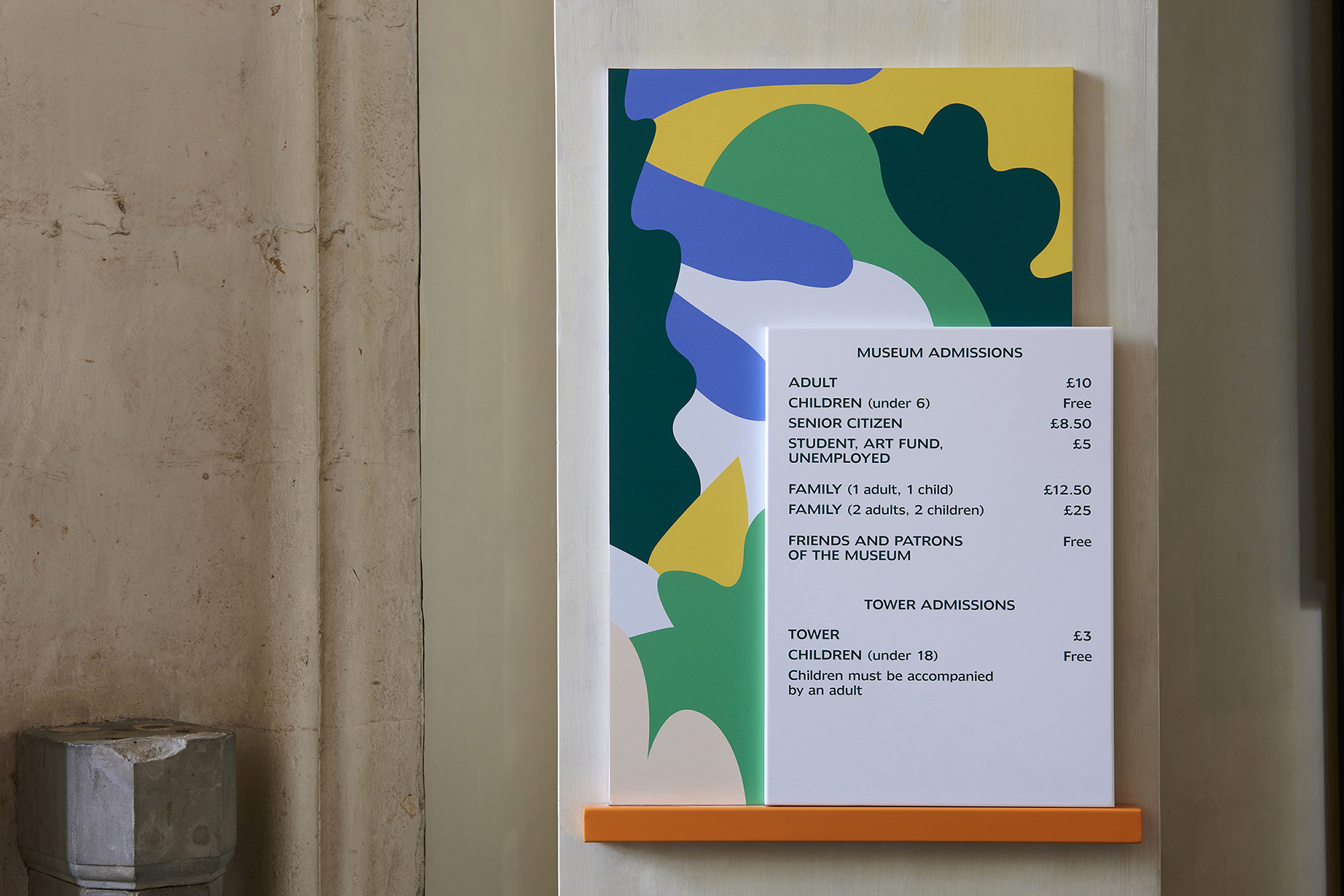
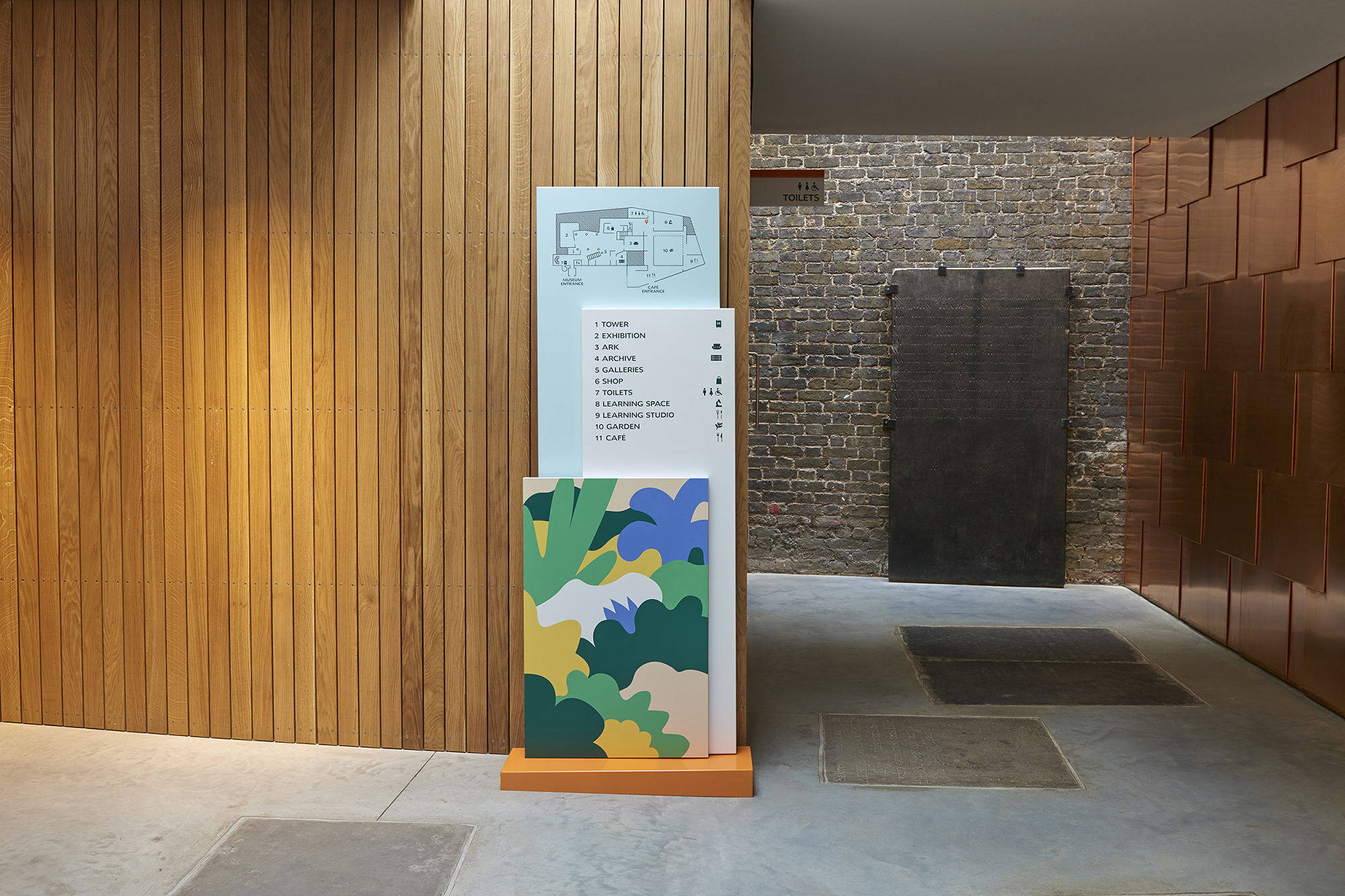
Powell and Hudson-Powell have created an identity that avoids overtly floral themes and instead references growth, new life and the organic nature of a living garden.
The visual language has been inspired by the work of Brazilian landscape artist, Roberto Burle Marx and takes the form of abstract representations of different seasons and types of flora.
When isolated, these same elements can be used as individual icons and applied across the brand.
“Deliberately imperfect”
“These shapes are deliberately imperfect and abstract, but when constructed into compositions, give a feeling of a living garden,” says Powell.
An additional set of more literal icons have also been created. They include a garden fork, a trowel and a bumble bee.
The wordmark is set in Humanist 970 – a typeface based on Doric, an early sans-serif released by the Stephenson Blake Foundry in 1816. As with typefaces of this time, the wordmark is deliberately organic and imperfect.
A secondary typeface, Amira, has a more contemporary woodcut feel and can be applied more widely.
Flexibility for changing tone
The main wordmark can be used on its own but has been designed to become “lively” by working with other elements and shapes where necessary.
This flexibility will be called upon for the museum’s events series, where the tone is likely to change.
Signage on site has been developed by Pentagram, as well as stationery and a new website. On site, the signage system has been designed to be informative, surprising and playful.
The website takes on the playful look and feel of the identity but has been designed primarily with a simple user experience in mind.


I love designer descriptions, ‘contemporary woodcut feel’, blah, blah, blah.
I adore this.