Form turns the corner with new identity for music management company Popular
Form has created the identity for music management and promotions company Popular.
Form was appointed in September after the client approached the consultancy and briefed it to create a marque that could be used on its website, Facebook and Twitter pages, as well as on print mailers, flyers and business cards.
Form partner Paul West says, ’With this type of music management business there are many alleyways of “grooviness” that you could go down, but Leon [Wright, founder of Popular] wanted something smart and simple.’
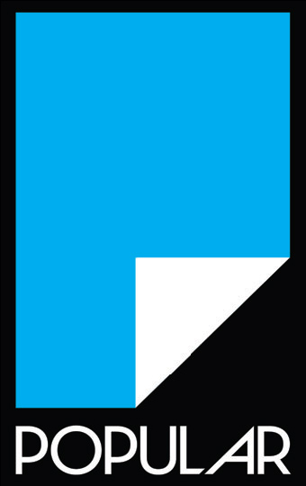
Inspiration for the identity, which will roll out online from the end of the month, came during a consultancy brainstorming session, says West. The logo is based on a piece of paper where the bottom right-hand corner has been folded up to create the letter ’P’.
The consultancy selected the typeface Neutraface because of the distinctive personality of its dropped bowls, and developed the ’A’ of Popular to reflect the fold of the paper, says West.
Form selected a colour palette of process colours, using white and cyan for the main identity, because of its stark and ordered quality, explains West.
Form has created poster templates and image treatment guidelines, using filters to transform images into shattered triangles, to reflect the marque.
Read this next

-
Post a comment


