Press 81 cider bottle glows with Touchpoint branding
Manchester-based consultancy Touchpoint has created branding and packaging for new premium cider brand Press 81.
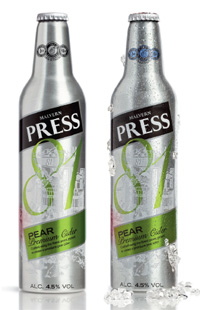
The new bottles will change colour to indicate when the cider is cold enough to drink (before and after pictured).
The consultancy was appointed to the work in January by client Aston Manor Brewery, having carried out previous projects for them.The brief was to develop packaging that looks traditional with a contemporary twist, to assert Press 81 as an aspirational, fashionable brand, explains Howard Wright, creative director at Touchpoint.
Touchpoint worked with the brewery to develop the name, which refers to the cider’s status as the 81st recipe created by Aston Manor Brewery.
Wright says, ’The brand had to give the feeling that the product had heritage and provenance, but was delivered in a new way.’
The recyclable aluminium bottle, which will roll out in June, features a thermo-chromic stamp on the bottle neck which changes to a blue colour when the cider is chilled to the optimum temperature.
Wright says, ’We wanted the stamp to have authority, but be unique to Press 81. The rings communicate the benefits of the product, have the feeling of a crest and can be used as a stamp of endorsement.’
To create stand-out from other cider brands, Touchpoint opted against using bright, garish colours, instead creating a more sophisticated look using sleek typography and an illustration of a traditional cider press, says Wright.
He adds, ’The illustration’s style is like a Victorian etching, harking back to rural landscapes and that type of imagery.’
The illustration has been printed in UV ink so that in a club environment the bottle goes into silhouette and the illustration glows.
A UV finish has been masked over the ’81’ of the branding, so that it stands out in contrast to the illustration.

-
Post a comment


