Rose Design and Tate Britain combine for Vorticism show
An exhibition on the Vorticism art movement is set to open at Tate Britain in London next week, with branding and exhibition work carried out by Rose Design, inspired by an original Vorticist periodical, Blast.
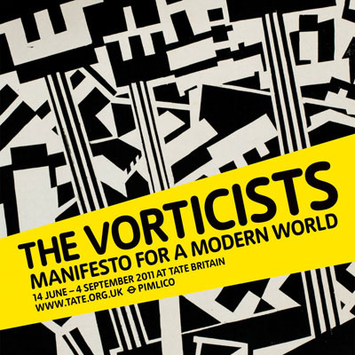
The show, Vorticists: Manifesto for a Modern World, which runs from 14 June-4 September, celebrates the shortlived London-based Modernist art movement from the early 20th century, noted for what Tate Britain calls ’machine age forms and energetic imagery’.
The exhibition will bring together more than 100 key Vorticism works, including paintings, sculptures and journals. Also on display will be a number of Vortographs claimed as the first abstract photographs.
The consultancy was approached directly by the Tate in March 2010 and asked to develop an exhibition catalogue before looking at a marketing campaign in December 2010 and exhibition design last April.
Taking visual cues from a 1914 edition of Blast there were only ever two issues of the title consultancy designer Rupert Gowar-Cliffe says ’a strong typographic’ approach was developed using contrasting colours; black writing on a yellow band. The Blast cover used pink and black.
Blast was published in 1914 and then again in 1915 and was edited by Vorticist Wyndham Lewis. A literary magazine, it contained work byEzra Pound and TS Eliot, as well as contributions by Vorticist artists.
Rose Design’s catalogue is 220 x 275mm (portrait) and typeset in Woody and Folio.
’We wanted a warm treatment, so have put together a small selection of blues, pinks and yellows’ to make up the brand palette,’ says Gowar-Cliffe.
Invitations, a Web banner, a leaflet and a bookmark have been designed and are being rolled out, with some versions of the brand including the catalogue cover and a poster using a lead image, Rotterdam by Edward Wadsworth.
In the exhibition space Rose Design is applying a continuation of the brand to ensure a ’visual connection’, says Gowar-Cliffe.
Neutral greys will backdrop rooms, ’so as not to overshadow the work itself’, he adds.
A timeline has been included to chart the movement, which is pinpointed as running from 1910-1918. Applied as a vinyl wall graphic it shows the context of what was happening historically at the time.
Labels and text carrying the brand have also been designed ’continuing the brand themes’, says Gowar-Cliffe.
Celeste Menich, print and design manager for Tate, says Rose was briefed to reflect the work of the Vorticists, adding, ’A bold typographical style is key also playing on the retro nature of Vorticist work.’
Vorticism
- Ezra Pound coined the term Vorticism in 1913
- Its establishment is traced to a collective, the Rebel Art Centre, led by Wyndham Lewis
- Its main exponents include Malcolm Arbuthnot, Lawrence Atkinson, David Bomberg, and Alvin Langdon Coburn
-
Post a comment


