Logo redirects McDonald’s Europe
Crescent Lodge has revamped the identity for McDonald’s Europe, the business support and strategic direction arm of the fast food giant.
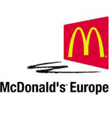
The revamp, which launches this week, follows the company’s name change from McDonald’s Development and was inspired by a desire to achieve a greater European feel to the identity, says McDonald’s Europe vice-president corporate affairs Mike Love.
‘The previous logo used a globe [motif] and we wanted something a bit more contemporary and European,’ he says.
‘[In the new identity] the shadow of the golden arches is a subtle representation of the “E” in Europe,’ Love adds.
Crescent Lodge had to comply with McDonald’s stringent identity guidelines and was looking for an identity that said something about Europe, but didn’t use the standard European motifs, says senior designer Juliet Husband.
‘The golden arches, corporate typeface and colours are sacrosanct. We needed to reflect the original McDonald’s branding without damaging it,’ she says
‘We experimented within the sacrosanct elements to develop something contemporary. The logo needed to be fresh with serious undertones as it is used in a business-to-business environment,’ she adds.
The work includes the revamped identity and stationery. Corporate literature is likely to follow.
McDonald’s Europe provides business support functions to 50 country markets in the European region.
The group, which has had a long-term relationship with McDonald’s Europe, began working on the project earlier this year and was appointed without a pitch.
Read this next

-
Post a comment


