Leeds United looks to improve football fan experience with new store
The club’s refreshed retail concept features LED signposting, a core colour palette of blue and gold to reflect the team colours, and a zig-zag pattern used throughout.
Design studio Roar has created two official stores for Leeds United Football Club (LUFC) in the team’s home city.
The flagship store has been designed within the Elland Road stadium ground and a second store, which follows a similar layout, has been opened at the Leeds Trinity Shopping Centre.
Inspired by the “grandeur” of Leeds

The studio took inspiration from both the ground itself and Leeds as a city, in particular the Corn Exchange, according to senior designer Jordan Ivey.
“It became a combination of Leeds’ history as a city and its grandeur and all these little brutalist details you find in the ground,” Ivey says of the Elland Road store.
One main element inspired by the ground is the zig-zag concrete used throughout.
“That is how the concrete would have been set when they were building stadiums – it would have been done for structural reasons, not aesthetics,” Ivey says. “But we saw this as way of bringing the store more in line with the stadium.”
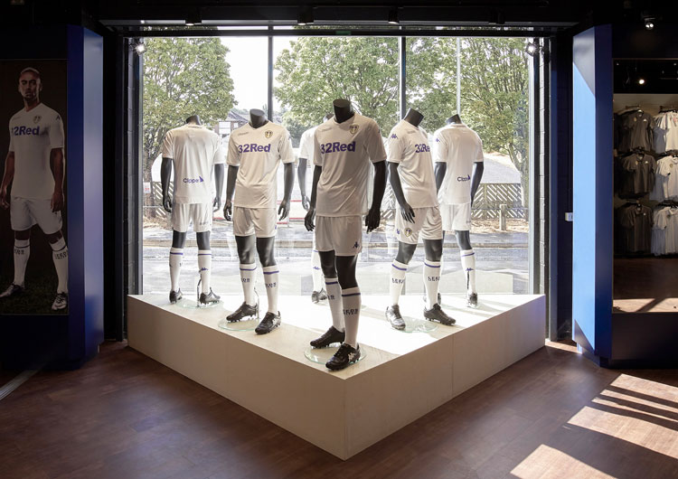
This has been combined with wooden flooring, new glazing to bring more light into the store and a blue fence outside.
Yellow swapped for gold
LUFC colours are blue and yellow, but the latter has been swapped out in favour of “antique gold” as it was decided this fitted better with the “imperial blue” and “putty” colours used across the store, Ivey says. It also gives a nod to the city’s “grandeur”, he adds.
Triangular shapes also feature “prominently” in the design.
Ivey says: “Not only is it in the zig-zag concrete, we used that triangular shape in pretty much everything we designed – some of the mid-floor units, many of the mannequin bases and the privacy screen walls behind the tills.”
The product signage around the store, which features gold foliage on white acrylic, is also triangular.
Improve customer movement around store

The brief included points such as increasing turnover, increasing the number of units on display, addressing the customer flow around the store and increasing the holding capacity.
As such, the way people navigate the store became a key part of the design.
“It was really about taking customers around the store on a defined route to shop all of the products, as well as to get them in and out without bottlenecking,” Ivey says.
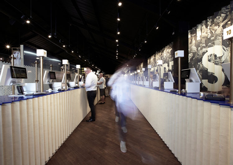
To achieve this, the store was split into two through the creation of a corridor, which leads people along the left-hand side, before doing a U-turn and taking them back down the right side, through the tills and to the exit.
Three-metre high walls have been installed to separate the left and right sides.
Encourage fans to look beyond football kits
“We wanted to make sure the customers shopped the whole store, rather than just go towards the kits and leave,” he says. “We want them to see all the merchandise.”
He compared the layout to Ikea, where customers are taken around the whole store on a set route before reaching the exit.
Bespoke pole displays have been fitted to the tall concrete walls and additional mid-floor units have been installed between the walls to display more products.
“To redesign the store so it had more space and flow but also have more units on show was quite a challenge,” Ivey says.
LED displays showing promotions and orders

Two main graphic displays feature on either side of the tills, both of which continue the triangular theme. One is a large zig-zag golden wall which has “side before self”, a Leeds motto, written on it.
The other is a historical image of some of Leeds United’s “most famous players”, says Ivey, which is set with a half-tone shade effect created out of triangle shapes again.
One “unique” feature the studio is keen to flag up is a printing station with scrolling LED words on it.
Ivey says: “We built a goalpost-like structure over the tills on the printing station. The workings of the LEDs are hidden by a white section of glass.
“When the system is off it looks like a goalpost, but when it is on the staff can program it to have words in LEDs go up one side of the goalpost and then down the other.”
The system can be programmed to say anything, from order numbers to Leeds United slogans or shop offers. As the LEDS are hidden, it has the appearance of white glass when they are not turned on.
Turn shop into “retail destination”

A shop has been at Elland Road for years, existing within an “industrial warehouse” type building but it has not been redesigned until now. The aim was to take it from a simple shop to a “retail destination” for the 35,000 fans who attend home games, according to Roar.
The brief also included reducing queuing times and upping overall turnover by 20%. Simon Moss, head of retail at LUFC, says there has been a 25% growth in sales in the first week following the redesign, as well as a “positive response” from fans.
The Leeds Trinity store follows the same aesthetics as the Elland Road store, but on a smaller scale.
Leeds United brand could soon change, too
In January this year, Leeds United revealed a new football crest, which received mass criticism from fans nationwide. In response, the club opened the design of the crest up to public consultation, and has since received over 1,200 ideas for a new badge design from supporters.
The club has delayed the launch of a new crest until 2019-2020, which will mark 100 years since Leeds United was founded.
Leeds United F.C. Shopfit: The Making Of from ROAR Creativity on Vimeo.
-
Post a comment


