
The architectural inspiration behind a British research network’s new identity
Manchester-based design studio Only has refreshed the branding for the British International Research Institutes, which can flex across region.
Design studio Only has crafted the new identity for the British International Research Institutes (BIRI), a network of cultural and academic hubs between the UK and the world.
Only has created a new logo, inspired by Doric the order, as well as the logotype, printed materials and wider identity work for the group.
BIRI’s institutes are located in southern Europe, Africa, Turkey, and more, and seek to provide a network of local contacts and cultural activities. They also provide funding and grants for academic scholars.
One of the aims of the new branding was to promote a “greater connectedness” across the eight research institutes set among diverse regions around the world, according to Only creative director Matthew Tweddle.
An identity that can flex across regions
Tweddle adds: “In the context of increasing interest in the international influence of UK research, we were approached to capture the unique benefits of the BIRI, to highlight the potential for greater connectedness across the network and to take the creation of a strong collaborative image further.”
One of the main challenges for the project was balancing the UK’s contribution to the research landscape “without ever being seen to be trying to exert any kind of British influence overseas,” the designer says.
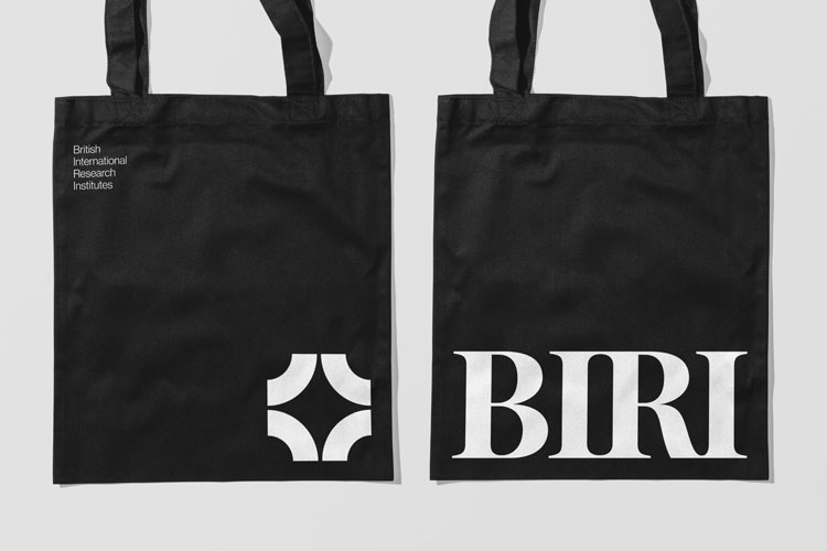
The studio looked to subtle details for the identity. The ‘i’s in the logotype are inspired by the Doric order, the Greek architectural system most clearly seen in columns that line classical temples. These convey “a subject and regional relevance”, Tweddle adds.
The marque meanwhile is formed from eight points, which refer to the eight founding institutes and form a star in the negative space. Together, these suggest that BIRI is a “leading light in the arts, humanities and social sciences”, according to Tweddle.

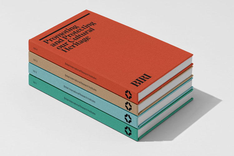
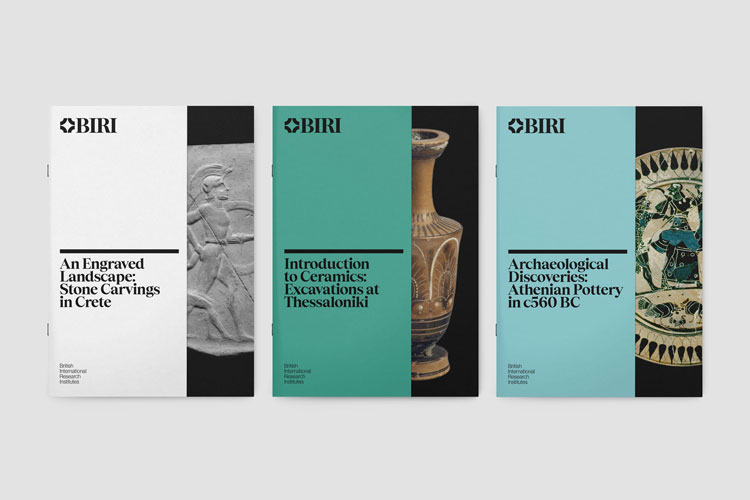
The logo also forms a graphic pattern that can be seen on BIRI’s newly-designed supporting material, such as bookmarks and brochures.
The colour palette has been inspired by the regions where BIRI can be found, Tweddle explains, from a Persian Green to Levantine Blue. It can change depending on region as well as the various services on offer, explains the designer.

Tobias from type foundry Displaay has been chosen as the headline typeface. The design team wanted a serif font which would evoke “heritage and prestige” but was also “modern and accessible”, says Tweddle.
The letterforms have been adjusted for the logotype in an attempt to “accentuate the architectural reference and improve the relationship with the marque”, he adds.
The team redrew the leg of the ‘R’ and aligned the crossbars with the star-shaped symbol, Tweddle continues, and asked type designer Rob Clarke to look over the final design.
With the new identity, Tweddle hopes that BIRI can take a stride towards a “more connected future, despite the inevitable complexity of bringing historic institutes together”.
What do you think of BIRI’s new identity? Let us know in the comments below.
Read this next

-
Post a comment


