Back-to-back to the future
London design consultancy Grundy Northedge has developed a new identity for the Royal Institute of Chartered Surveyors (RICS) Research Foundation, which will roll out on corporate literature, a research report entitled 2020: Visions of the Future, and the official launch invitation on 21 January.
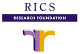
‘The RICS has its own logo, a lion holding a survey rod,’ says Tilly Northedge, partner in Grundy & Northedge, ‘but within the RICS they also have the Research Foundation, an academic department producing reports for a specialised audience. The RICS Research Foundation had no particular identity, so they decided to relaunch it giving it a higher profile. The brief was to create a modern, fresh and forward-thinking look.’
Stephen Brown, head of research at RICS Research Foundation, says it was important to underline both the connection of the Research Foundation with the RICS, but also its own autonomy. ‘We wanted something that would work on different formats and sizes and in black and white. The design had to be clean and not too fussy.’
The logotype produced by Grundy Northedge is ‘two Rs back-to-back, which refers to both RICS and Research Foundation. ‘Out of 5-6 different ideas the clients quickly decided on this one. It has an organic, natural look and looks like an archway, reflecting the institution’s architectural and support nature,’ says Northedge.
The bold purple and bright yellow elaborate on the previous corporate look. ‘We do a lot of other work for RICS and purple is the house colour relating to the mother institute. We added yellow as a nice optimistic colour,’ adds Northedge. The type used is also a synthesis of old and new design: RICS is spelt out in Century, the corporate old style type, while Research Foundation uses Futura.
The most interesting application of the new logo is within the 2020: Visions of the Future reports, essays focusing on work, shopping, housing, countryside, transport and leisure. Written by relevant experts, the covers feature children’s drawings, giving the corporate literature a light, fun feel. Brown says, ‘We had to encourage people to pick up the literature. The vibrant colours and design have that value of involving the readers.’
Designers Tilly Northedge, Peter Grundy, Graeme Kendrew
Client Royal Institute of Chartered Surveyors
Read this next

-
Post a comment


