Waitrose wake up for cereal packs
Pearlfisher has refreshed packaging for grocery giant Waitrose’s cereals range, following an internal range review and the introduction of 21 varieties.
‘We hadn’t had a revamp in terms of product or packaging for some time,’ says Waitrose grocery buyer Steve Wallace, who is overseeing the relaunch. ‘There are now 45 lines, but they’ve been introduced at different times, so there is no consistent thread bringing them all together.’
Wallace says he briefed Pearlfisher to bring ‘synergy’ to the range and to increase its appeal and shelf stand-out.
The challenge was to create a unique, unified look and simultaneously adhere to a ‘strict’ category language, says consultancy creative director Shaun Bowen.
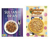
‘It’s normal to show the product [on pack] and to use certain colours, but we wanted to do it in a sophisticated and subtle way.’
He says the entire range is based on the theme of a breakfast table setting, providing a ‘consistent base’ for individual products. Cereals at the premium end of the range feature modern, tiled ‘surfaces’, while those aimed at children are pictured on colourful tablecloths.
Pearlfisher was appointed to the work in October. The new-look packaging rolls out in two phases; the first this month, and the second in August.
Read this next

-
Post a comment


