Local Hero
Mike Dempsey takes an affectionate look at graphic designer John Gorham, a friend and colleague who spent his life striving for perfection in his work
When I originally discussed the Heroes series with Lynda Relph-Knight, the first designer I intended to feature was John Gorham. Unfortunately, on telephoning him, I learned from his wife Pauline that he had been ill for some time and was not in the right frame of mind to talk to anyone at present. We left it that she would call me when he was feeling stronger. The call never came. John died.
I first met him in 1968 when I had just joined the publishing house William Heinemann as its art director. One of the first tasks was to seek a group of freelance designers whom I admired and who would be willing to accept the embarrassingly low fees on offer. Luckily, designers love to tackle book covers and always have. The tradition goes back a long way and somehow money never seems to figure in the equation. This was heartening for me because one of the designers I wanted to net was John.
At the time he shared a large, airy studio in London’s Regent Street with fellow designer Richard Weaver. It was an exciting time for John; his work was beginning to appear everywhere, particularly in advertising. His vibrant, hand-lettered logotype for the Watney’s Roll out the Red Barrel campaign had made a great impact and everyone was clamouring for his unique ability as a creative lettering artist.
Not knowing what to expect at our first meeting, I was immediately struck by his almost childlike enthusiasm for design. I found it refreshing to discover that I was not the only one with this all-consuming passion. Neither of us had received formal training in design, so we found common ground immediately and struck up a friendship, employing the verbal shorthand used by people familiar with their subject.
He became a regular visitor to my cramped attic studio at William Heinemann’s Mayfair offices. I always looked forward to these visits, just to see how long he would keep me waiting before unveiling the design he had been working on. John would never be rushed and our meetings could effortlessly burn up an hour. After the second cup of tea, he would finally unzip his faithful black leather portfolio to reveal an impeccably hand-rendered rough. I was in awe of his ability.
He would then set about telling me just how much better the real thing would be, and with John, the real thing would undergo constant changes right up to the wire. He was a consummate craftsman whose typography, illustration and hand-lettering were immaculately finished. He also had an exceptional talent for ideas. Just a glance at Beryl McAlhone and David Stuart’s book, A Smile in the Mind is testament to this.
When I moved on to another publishing house, John was on hand to give me support. Over the next ten-year period, our paths often crossed. In the 1970s, we both became involved with a new generation of film-makers from the world of advertising. David Puttnam was central to this, and Gorham relished the prospect of working for the cinema, beginning with his graphics and titles for Alan Parker’s Bugsy Malone. Many more followed, including Chariots of Fire, The Mission, Fame, Greystoke, Local Hero and Cal. Puttnam, who supplied John with a constant stream of enviable work, produced most of these films.
He became the bespoke designer of personal stationery for the ad industry elite. Each design was lovingly crafted and agonised over, then printed on just the right choice of paper, often beautifully die-stamped. Parker used his for sending wittily penned cartoons.
In between all this glamorous work, John found time to design a continuous stream of book covers. Just thumbing through a stack of these gives you a good insight into the man. Here are a few of the titles: The Village Cricket Match; Written for Children; The Naturalist in Britain; Barns Wallis; The English Difference; The Two Hour Gardener; and Follow On. That last book was the autobiography of the great cricket writer EW Swanton, a hero of Gorham’s. When I told him that Swanton was so taken by the cover that he wanted to buy it, John was thrilled to bits. Cricket was a great passion of his and as always, he allied himself to the things he loved and in doing so gave his all.
For a time John was based in Covent Gar-den, but after a while he decided to abandon London to work from his home in Surrey. He settled into a routine. I can remember him telling me not to ring him on a Friday because that was the day that Pauline drove him into Guildford to do the weekly shop at Sainsbury’s (John never learned to drive). I think he missed the chance encounters that occur when working in a bustling city. This lack of daily contact made his visits to London even more important. He would try to fill his entire day with appointments, often topped off with a visit to David Drummond’s Victorian Pastimes and Pleasures, off St Martin’s Lane. Here he would positively get a high, leafing through old children’s annuals, posters, programmes, magazines and Victorian scraps.
John had a formidable collection of printed ephemera, which he always referred to as his “treasures”. These would be carefully stored in boxes destined for the attic, only to be opened when he needed a little fix. He told me he was becoming worried about the weight of all this stuff on the ceiling and that he was seriously considering having it reinforced.
He would often collaborate with other creatives on projects, but these individuals had to demonstrate the same commitment to their craft as he did to his own. They included photographer the late Tony Evans, designer Howard Brown and illustrators Andrew Davidson, Allan Manham and Arthur Robbins.
John’s range was quite staggering, including posters, packaging, book covers, film titles, calendars, wine labels, postage stamps, magazine spreads, books, logotypes, illustrations and typefaces.
I think I was one of the first people to see his rough concepts for the British Design & Art Direction silver award-winning Winsor & Newton ink packaging. It was clear at first glance that this piece of work was going to have a major impact on the field of packaging design. What followed in that area clearly shows the influence of his work.
The great work he produced for Face Photosetting was, in my view, heightened because of the tacit competition between Gorham and John McConnell, who designed for and was very involved with Face at the time. Being pitched against McConnell’s formidable talent is a daunting prospect, but John would always manage to pull it off, producing some of his most witty and intelligent pieces.
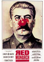
The film poster he produced with Brown for Red Monarch featured a portrait of Josef Stalin on which there is the most perfectly placed squashed tomato, photographed by Evans. Imagine three perfectionists on one job – it must have been a nightmare.
During the late 1970s and early 1980s, John experienced a new challenge, teaching at the Royal College of Art. He was proud of this, but it was mixed with amusement, because of his own lack of any formal design training.
As the 1990s progressed, John found it harder to come to terms with the impact that new technology had made on the design industry. Doggedly refusing to embrace the Apple Mac, he sent out a defiant mailer to all his clients and friends. On it was a photograph of the back of a crumpled envelope and below that a pencil, it simply said, “My only gizmo and its mouse”. It summed John up perfectly. The thought of losing direct physical contact with his work was something he could not envisage.
But the world moved on and the traditional methods of working were cast aside. No more painstakingly separated artwork with Kodatrace overlays. Or the tracing covers, lovingly “spec’d” up for the printer. No more type mark-ups for the compositor, using the symbols that, to many designers today, look like a foreign language. John felt out of tune with the world he once knew so well. He believed sometimes that he was left holding a torch that represented an attention to detail that no one seemed to care about any more.
He settled for a quieter life, turning his attention to his other passion of gardening. His garden was lovingly tended with a vegetable patch that would have made even Beatrix Potter’s Mr McGregor green with envy. He would continue to work on the occasional project, but it would have to be on his terms. Stamps to celebrate the Queen Mother’s birthday and two Christmas issues all bore the hallmarks of John’s approach to graphic design.
Puttnam told me, just after he had been made a Peer of the Realm, that he had commissioned John to design his heraldic crest. It was a job that demanded the range of craft-based skills that only John possessed and he salivated at the prospect. Davidson was planning to collaborate with John on two books about the countryside. They had long and enthusiastic conversations about the projects, before John became unwell and was unable to work.
The last piece of work that I received from John was his annual Christmas card, something he hadn’t missed for over 30 years. The card was to celebrate the coming of the new Millennium. It featured two partygoers holding their champagne glasses aloft. The juxtaposition of their festive hats created the shape of a double “M”. There’s always an idea with John.
He was one of the few people who was equally loved and admired by both the design and advertising communities. In 1993 he received the D&AD President’s Award. The array of influential industry figures that paid homage to him on that night was astonishing.
John never had children, but when I think of it, perhaps his work was his children. He would lovingly nurture each piece of work into life, with all the care and attention afforded to a newborn baby.
For me he is an equivalent of John Betjeman, a great favourite of John’s. The countryside, the changing seasons, the ordinary everyday quirkiness of the English and the wealth of craft left behind from another era were all things that John cared about passionately.
John was an unassuming superstar who kept his ego firmly in a cardboard box in the attic along with his treasures.
He leaves behind a body of work that reaches back nearly 40 years. It will quietly live on in libraries, bookshops and ephemera fairs, in fact in all the places he loved to rummage through. It may be out of favour at present, but one day a fresh young designer will stumble upon John’s work, and will stop and take in its beauty. And it will be born again.
A Smile in the Mind by Beryl McAlhone and David Stuart, is designed by The Partners and published by Phaidon
Read this next

-
Post a comment


