Go with the flow
Galleries of any size face the issues of how to get visitors in and how to help them navigate the space. In both cases, getting the signs right is essential, whether it’s the huge task of devising the £600 000 information design system at the labyrinthine
Camden Arts Centre
Designer: Intro
Manufacturer: IVC Sign Studio
A Grade II-listed former library, Camden Arts Centre in North London has just undergone a major refurbishment by Tony Fretton Architects, complemented by new graphics and signs by Intro.
The designers, whose previous arts work includes the Fact arts centre in Liverpool, wanted a strong and simple graphic identity that wasn’t just a logo. They chose a Helvetica bold font with an adapted lower case ‘a’ on the arts centre, and a flexible circular device that sometimes appears small, sometimes large.
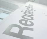
Intro also had the idea of running the graphics upwards vertically rather than horizontally where appropriate. ‘It felt right for the signage,’ says art director Julian House. For these, the group implemented signs using vinyl, applied directly to clear glass doors, such as those indicating the way to the upstairs galleries.
Where doors are opaque because they house administrative facilities, the signs are instead etched, the copy running upwards. Other icons indicating nappy changing and toilets facilities, for example, are simply painted in grey on to the white walls so as not to conflict with the restrained design of the foyer.
Upstairs, information on the exhibits is also applied directly to the walls. Outside, signs consist of a white monolith on the corner plus two more information signs planned for the side of the building.
Read this next

-
Post a comment


