Ballot box branding

As the Conservative Party is considering ditching its ‘flaming torch’ identity, Scott Billings examines the story behind Tory branding
Albert Speer knew a thing or two about visual impact. Even with the weight of hindsight, exposure to footage of the Nuremberg rallies in the 1930s is still wincingly affecting. And, while the movement may have been vile, the power to wield political influence by employing iconographic imagery and stage-set design is nonetheless remarkable.
But, as Adolf Hitler’s head of architecture, Speer was operating at political and ideological extremes. His regimented marching troops and dramatic columns of light are devices for a Fascist campaign, visual techniques that could apply to a similarly zealous far Left, but which will not sit with 21st century liberal politics. So, how do you make communications impact in the centre ground of contemporary politics?
The Conservative Party is now asking itself this question, having launched a rebranding exercise that is likely to extinguish its Rule Britannia-style flaming torch identity, designed by Michael Peters Group in 1989, opting for something more suited to leader David Cameron’s new political style of concerned, environmentally-minded compassion.
Tory chairman Francis Maude revealed last week that a party rebrand is on the cards and that the torch identity, which was redrawn last year by advertising agency M&C Saatchi, may be dropped. Officially, the party is playing down the enterprise. ‘The branding is a very small part of a wider change programme that Cameron is leading. We don’t have any fixed, firm ideas or schedules and we are open to discussions and advice,’ says a spokeswoman. However, an appointment to undertake the branding has been made, she says, although details are being withheld.
Maude describes the identity project as ‘one of those quite superficial things which is not occupying more than a fraction of any of our time’. But, according to Michael Peters (pictured below right), who is now chairman at Identica, the party needs to take a wholesale look at the way it communicates itself. ‘I think the torch is a problem,’ he says. ‘M&C took my work and what they did is an abomination, a terrible piece of communication. What they should have done – and what the party needs – is a completely fresh, top-to-bottom look at what it stands for, and to think of a clear way of representing that. This may not even include a new logo, but could be in the tone of voice used. To evolve what they had was wrong. The torch had meaning at the time of [Margaret] Thatcher, but not any more. It is far too aggressive and heavy-handed.’

Cameron appears to be steering further towards the centre ground. In this zone of the political spectrum, it is more difficult to carve out a distinct and powerful visual identity, according to Johnson Banks creative director Michael Johnson. ‘It is very difficult indeed to do anything [politically] central that is of any interest. And it is often very hard to get anything interesting through [the process],’ he says.
Simon John, managing director of Roundel, also believes that the party will find it harder to cut a visual dash while pronouncing centrist politics. ‘The problem they’ve got is how to communicate the middle ground. In traditional branding, the most successful brands are those which have a clear point of difference,’ he says. Compared to Speer’s show of might, Cameron’s ‘blue bicycle’ is perhaps less arresting.
But, according to Johnson, the symbol of a party is actually its leader. ‘It is a human symbol. This is where we’re at now,’ he says. During the design stage, the Tories’ original flaming torch was held aloft by three hands, representing a coming together in unity. This was reduced to one, masculine hand. But to receive final approval, the design was further refined to depict a single, slender, female hand. Thatcher was on her way out, but not quite gone.
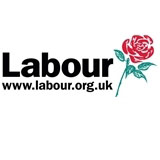
As one ‘small part’ of Cameron’s wider reform, is the branding process taken seriously at the Conservative Party? ‘Political parties don’t seem to be able to quite get identity to work. You’d think a party would be able to take it seriously, but no one has. And it is partly because no one has done it well that they don’t take it seriously,’ adds Johnson. He notes that the Labour Party operates with two identities simultaneously/ the rose logo designed by Michael Wolff in the 1980s (and now seldom used), and the more prominent New Labour New Britain red square marque, created in-house for the 1997 party conference.
Under former party leader Michael Howard, the then Tory marketing director Will Harris appointed Williams Murray Hamm to undertake a branding project, the results of which never saw the light of day. He also brought in Interbrand, which produced three new identities that Harris presented to Howard. ‘In the end, there were three logos that Jez Frampton of Interbrand [oversaw], but they weren’t used. I think what I wanted to do came one leader too soon,’ he says.
According to Harris, rebranding a party is a make-or-break chance to go into Government that only comes along once every four years. ‘There is a real fear that if you change the logo too close to an election, people may get confused when they see something unfamiliar on the ballot paper and make a mistake with their vote. For the Conservatives, the time to do it is now.’
BRANDING POLITICS:
Conservative Party – ‘freedom torch’ designed by Michael Peters Group in 1989, redrawn by M&C Saatchi in 2005
Labour Party – red rose designed by Michael Wolff at Wolff Olins in 1986; New Labour New Britain marque created in-house in 1997
Liberal Democrats – ‘bird of freedom’ originally created for the party’s formation in 1988 by Fitch; updated in 1999 by Rodney Fitch & Company
Green Party – Real Progress logo designed by Gwynedd consultancy Hebffinia in 2005
-
Post a comment


