
Dad rebrands digital perfumery avoiding “generic elegance” of other fragrance brands
The updated look for Sillages Paris features a new typeface, illustrations, art direction and brand visuals, all communicated in a “bold and fun” visual language.
Netherlands-based design consultancy Dad has rebranded an online perfumery in a bid to make its “unique” proposition more accessible.
Sillages Paris is described as a “digital-first” perfumery. Operating mostly online, the brand pairs consumers with their “signature” fragrance based on their preferred ingredient.
The company approached Dad to redesign its website back in April. The project eventually grew into a full rebranding project, comprising new art direction, illustrations, brand visuals and typography. In order to maintain some brand recognition in a “very different direction”, the previous Sillages logo has been retained.
A “balance of fun and seriousness”
Sillages wanted an agency that could help it communicate its value in “a more outspoken way”, Dad founders Leanne Bentley and Ulla-Britt Vogt tell Design Week.
“Their brand is quite different from other perfume brands,” the pair say. “They knew they wanted a bold and fun identity while also connecting to their roots as a Parisian perfumery.”
Bentley and Vogt say the “balance of fun and seriousness” found in Dad’s previous projects was what drew Sillages in.

“Translating the experience to a digital space”
Sillages’ unique business model is also one of its most challenging aspects to work with.
“Perfume is obviously something you smell, and the challenge from the beginning was translating this experience to a digital space,” the pair says, adding that the visuals for the brand “needed to work extra hard” to get the point across.
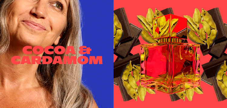
The use of bold and contrasting colours was intended to reflect the flexibility of Sillages’ offering. Ingredients can be mixed and matched depending on a customer’s preference and similarly bold colour combinations like green and red and orange and blue are used to show this.
“We wanted to create a brand with a bold and outspoken character”
To compete with the striking colours, Bentley and Vogt explain the typeface used throughout communications needed to be bold too.
“From a practical standpoint, the typeface needed to hold up against the portraits and visuals but we also wanted to set Sillages apart from the generic elegance of almost all other perfume brands,” they says. “We wanted to create a brand with a bold and outspoken character”
The visual identity stands in stark contrast to other perfumeries working today, the studio says.
“As simple and accessible as possible”
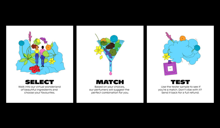
To help consumers understand what can at first glance be a “tricky proposition”, Dad has also created a series of illustrations which reveal the step by step process Sillages undertakes to match person and perfume.
The line drawing-style pieces takes consumers through the ingredient selection process, and then on to matching and testing. Other illustrations have been devised and developed for different applications on the site, with icons used to signify “clean and natural ingredients”, Sillages’ free deliveries and more.
“Our goal with everything we made for them was to make their proposition as simple and accessible as possible,” say Bentley and Vogt.


Read this next


Rockin’ the stretched pixel like it’s 2001