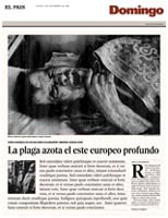
El Pais
Pentagram partner Fernando Gutiérrez is at pains to point out that his recent work on El Pais, Spain’s most prominent daily, isn’t so much of a ‘clean’ redesign so much as an ongoing tinker.
Pentagram partner Fernando Gutiérrez is at pains to point out that his recent work on El Pais, Spain’s most prominent daily, isn’t so much of a ‘clean’ redesign so much as an ongoing tinker. ‘I’m gradually tidying it up more than anything else,’ he explains.
Launched in 1975 soon after Franco died, the basic design of El Pais was originally conceived by the German Reinhard Gade. Set in a classic Times and Helvetica combination, it represented a new Spain and revelled in its freedom of speech, attracting contributions from leading Hispanic intellectuals such as Gabriel Garcia Marquez and Mario Vargas Llosa.
‘It was the first independent newspaper on the Spanish high street,’ says Gutiérrez. ‘I remember it as being dense and serious with solid type and rather grey text.’ And, by the 1980s, it was also extremely successful, pulling in around 450 000 readers daily and 1.5m on a Sunday – figures only the hugely popular Spanish sports papers could beat.
Gutiérrez first became involved with the paper during the early 1990s when he was at Grafica. He was instrumental in the launch of El Pais de Las Tentaciones, a supplement for younger readers covering film, music, theatre, listings and interviews. ‘It was vibrant, new and energetic,’ he recalls. ‘It made El Pais appear more contemporary and adventurous.’
Enthusiastically received by both the public and the design fraternity, Tentaciones paved the way for a new wave of editors, photographers, illustrators and designers, many of whom have now graduated to the main paper and were responsible for initiating the recent revamp. Gutiérrez is refining seven supplements in all, including arts, new media and travel sections, working closely with El Pais art director David Garcia and designer Lucy La Cava.
To an extent, the redesign has been dictated by the new Hermes layout system that has been installed at El Pais, which involves working in a series of pre-designated blocks. Though highly practical, in that five or so journalists can be working on a page simultaneously, according to Gutiérrez, it ‘is like designing with a straight-jacket on’. The main typeface remains Madrid, a version of Times reworked by Matthew Carter.
He sees his role as developing ‘clear specific rules’ that can be picked up by anyone who needs to lay out a page. ‘It’s a completely different way of working,’ he says. ‘Ultimately, the control is with the people in the trenches. The fewer questions they need to ask the quicker they can get the job done. The idea is to create a newspaper that is stylistically quite neutral, that just makes you want to read the stories.’
Where Gutiérrez hopes to create more impact is by ‘readdressing’ the photography and illustration, giving photos more ‘bounce and contrast’, being more adventurous with the type of illustration commissioned. ‘It’s all about creating a good ongoing relationship,’ he says. ‘Design is the least of it really.’
Read this next

-
Post a comment


