Make a statement
Mike Dempsey reflects on how annual reports have evolved, from the overblown excesses of the 1980s to the basic style that many clients favour today

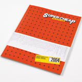
Of the many reports I reviewed for this piece I would single out Australian group Emery Frost’s report for Super Cheap Auto, a no-nonsense motor accessories chain with a distinct lack of sophistication on the graphics front. Rather than hide this aspect, the designers have made its very naffness the hero with brash, in-your-face honesty.
Love’s report for Youth Justice Trust also doubles as a tenth anniversary celebratory publication. The layout is punctuated with bold typographical ‘sound bites’ and there are human stories of the Trust’s success as a catalyst in helping to bring together Government agencies to tackle youth crime. There are also some nice typographical ideas going on, all presented in a very compact form. Another Love production was for Urban Splash, a property developer specialising in urban regeneration projects. Using the theme ‘US’ this hardback, produced in a non-standard size, features endpapers showing portraits of every Urban Splash employee and a brief biography of themselves and their favourite thing. In between there are a variety of rhythmic pages using photographs, large areas of flat colour and bold, typographical pull quotes.
Bell’s report for the Met Office chronicles its 150-year existence with a historic timeline of weather-related world events. For instance, the conquest of Everest in 1953 – apparently, it was a nice day to tackle the summit.
There are two contrasting reports from SAS, the first for the BBA Group, a leader in aviation services. The company’s report is beautifully understated and an excellently crafted piece of work, with photographs by Benedict Redgrove that have an eerie David Lynch quality. The second, and one I was particularly taken with, was a disarmingly stark report for the kitchen and furniture retailer MFI. No images, only two colours, almost pocketbook in size. It is remarkably honest, using a conversational tone that openly exposes the difficulties that the chain has had in recent years. Every other page is presented with large typographical statements, set in a slightly eccentric ‘prose poetry’ style with very odd line endings, but no matter, it works. Great attention to detail with beautiful printing and paper. And not a blouson in sight.
Mike Dempsey is chairman and founding partner of CDT Design
1 and 3 Cover and spread from Love’s report for Youth Justice Trust
2 MFI report by SAS
4 Spread from BBA Group report, created by SAS
5 Urban Splash report, designed by Love
6 Cover of Super Cheap Auto annual report, created by Emery Frost
-
Post a comment


