
Design inspiration: the best projects from May
Some of our favourite projects this month include illustrations for poet Thomas Hardy and a colourful basketball court in Canary Wharf.
Leeds Year of Culture 2023 identity, by Peter & Paul
Leeds has announced a year of culture to celebrate the city’s creativity, which will run throughout 2023. 12 events will showcase sectors from sport to poetry and art to food. To accompany this, Sheffield-based design studio Peter & Paul has designed a “kinetic” identity for the festival. With the tagline of ‘Letting Culture Loose’, the branding is inspired by the idea that “culture in Leeds is everywhere, but also sometimes invisible”, according to the studio. Yellow is used to represent the pollination of ideas while a ribbon motif is used throughout to highlight the city’s physical theatre movement as well as West Yorkshire’s affiliation with sculpture. “The design was really a response to what we found – a really vibrant cultural scene that needs to be seen more,” Peter & Paul creative director Lee Davies says.
Conversations from Calais billboards, from Buildhollywood

Conversations from Calais, an organisation which documents conversations between migrants and volunteers, has partnered with ad agency Buildhollywood on a series of new billboards. The posters will be displayed across eight UK cities and aim to bring to life conversations around poverty, famine and persecution. The designs depict real conversations, presented simply with black text on white backgrounds. “This ever-growing collection of conversations focuses on capturing the diversity of experiences and avoids creating new stereotypes of displaced people as villains, heroic figures or hopeless victims,” says Conversations from Calais founder Mathilda Della Torre. Della Torre, who is also a graphic designer and illustrator, hopes that the posters convey the sense of shared experience. She adds: “There are so many different stories and some of them describe things like the beauty of a blue sky, the reassurance of a phone call with our mother or the need for hand cream. I think those are the ones that remind us that we are not as different as we are told.”
The Colours of Pride redesigned flag, by Rethink

To mark the international day against homophobia and transphobia (17 May), Canadian design studio reinterpreted the LGBTQ+ flag for campaign group Fondation Émergence. The flag’s rainbows have been recreated with images of real wounds and bruises sustained by victims of hate crimes. While June is Pride month, the studio notes that “for some, showing their ‘colours’ isn’t a choice”. Fondation Émergence sent flags directly to government leaders of the UN member states that still have homophobic laws, such as those that impose the death penalty on same-sex couples.
Selected Poems of Thomas Hardy, illustrated by Stanley Donwood
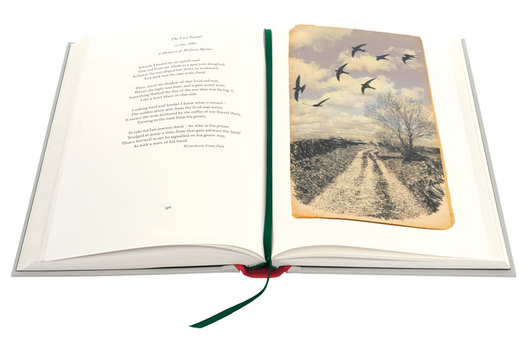
The Folio Society’s new edition of Thomas Hardy poems has been illustrated by long-term Radiohead collaborator Stanley Donwood. Donwood, who has designed some of the rock band’s most recognisable album covers, travelled to Dorset in search of the original sites from Hardy’s poetry. The resulting sequence of haunting illustrations have been developed on scraps of paper, pages ripped from yellowing books and even parts of maps. As a way to convey the poet’s mixture of past and present, Donwood has combined modern and ancient references in the visuals. Writer Robert Macfarlane – who has selected the poems for this edition – calls the illustrations a “slantwise and surprise” response to Hardy’s work.
UEFA Women’s Champions League identity and anthem, by Works Ltd and MassiveMusic
The 2021/22 season of the UEFA Women’s Champions League will launch with a new visual identity and anthem. The logo and branding has been created by Works Ltd, who also designed the identity for the Women’s Euros taking place next year. As well as an updated look, the competition will have its own anthem which has been designed by MassiveMusic. The sound design studio drew upon coronation anthems for queens and princesses as well as classical music for the project, which will play as team members arrive on the pitch. MassiveMusic executive creative producer Lodewijk Pöttker calls it a “bold and progressive anthem”. “Our ultimate goal for the UEFA Women’s Champions League anthem is to hold a timeless spirit, present in the ears of football fans for decades to come,” he adds.
Canary Wharf basketball court, by Yinka Ilori
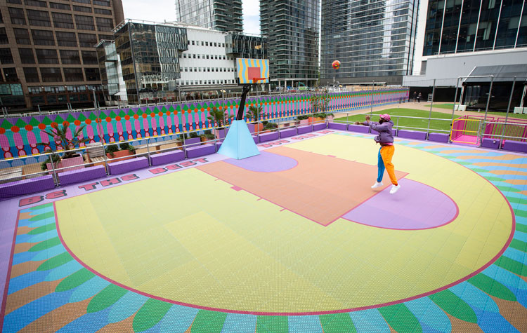
Fresh from designing sets and statuettes at the 2021 Brit Awards, Yinka Ilori has unveiled a basketball court at London’s Canary Wharf. Designed for two teams of three members with just one basketball hoop, players can battle it out among Ilori’s signature visual stylings. Combining both his British and Nigerian heritage, the graphics feature a wave pattern on the backboard while the court itself is mapped out in bright yellow, orange and purple. The top of the court features the tagline: ‘Be the best you can be’. “I wanted to give people a space they can come and just enjoy being outdoors and being together again,” Ilori says. He adds that the installation may challenge “any perceptions of what people might once had of the area”.
Let us know your favourite design projects from the past month in the comments below.
Read this next

-
Post a comment


