
Breathing Colour: The Design Museum’s latest show on the work of Hella Jongerius
The new exhibition looks at the Dutch designer’s research into the endless possibilities of colour, and aims to open visitors’ eyes to the world around them.
Colours have long been assigned specific shades based on prescriptive charts and numerical values from the likes of Pantone and NCS (Natural Colour System).
These charts are extensive and a valuable tool for those working in the design industry, from interiors to graphics; but does this strict, rigid system really represent the millions of shades that can be created when light hits an object?
For the last decade, Dutch, Berlin-based industrial designer Hella Jongerius has conducted research that challenges the clinical way different colours are made and sold in the paint and manufacturing industries, and in turn challenge how they are perceived by designers.
The Design Museum’s latest exhibition is dedicated to Jongerius’ work, and aims to embrace the idea that colours may not be rigid, and instead change depending on other factors such as time of day, shape and form of an object, and surrounding environment.
Breathing Colour takes over the basement gallery of the museum, and is split into three key sections; Morning, Noon and Evening.
Fittingly, the space – designed by Claus Wiersma, with graphics by Robert Beckand, lighting by Zumtobel and audio by Richard Cameron – allows the exhibits and their array of colours to breathe. A palette of grey, white and black is used for the wall paint, while lighting gradually dims and brightens, and an undulating, ambient soundscape sets the mood.
The wall paint has been mixed by Switzerland-based company KT.Colour, which reject mass, industrial methods of paint-making for more bespoke methods. Rather than creating black by mixing in carbon, the company mixes together complementary shades, a technique more akin to a painter than a paint producer.

Alex Newson, senior curator at the Design Museum, says that the result is a deep blue that appears black, which, alongside the ever-changing audio and lighting, reflects Jongerius’ idea of subjectivity.
“Carbon does make colours blacker, but it also dirties them,” he says. “It makes them grubbier and grimier. Hella once said, ‘I’m not concerned with having the blackest black, I’m concerned with having the richest.’ It’s not just about deepness, it’s about tone and quality.”
The exhibition gradually darkens as visitors explore Morning, Noon and Evening. Each section uses everyday objects to contextualise how changing light affects the colours we perceive.

Morning features a series of hanging translucent and semi-translucent beads and textiles, which give off a multi-coloured gleam, demonstrating the broad spectrum generated when light passes through and refracts off them.
Evening explores the role of shadows, through physically recreating shadows cast by famous furniture designs, and also questions the definition of “black” through multiple, hanging tapestries that create black shades without the use of black materials.
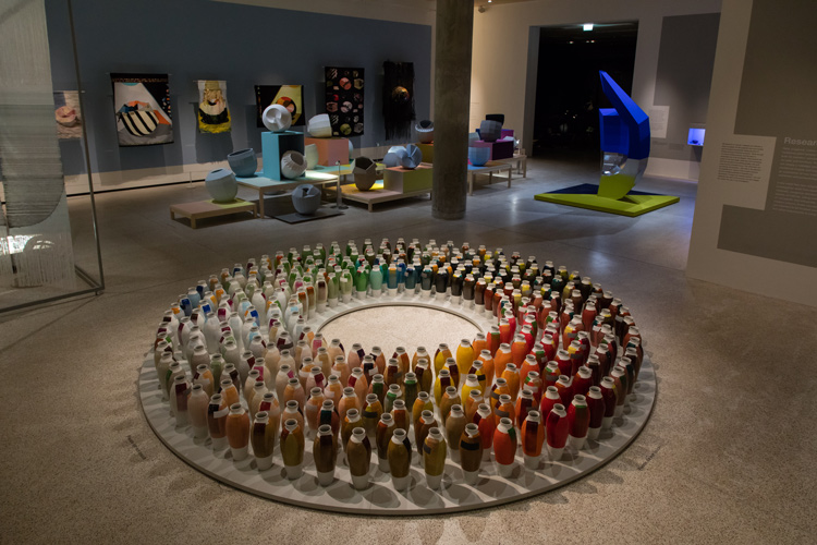
Also featured in the exhibition is Jongerius’ existing piece Colour Vases, which looks at a now-defunct scientific technique used to colour objects, through the use of chemicals; for example, copper oxide produces a green colour.
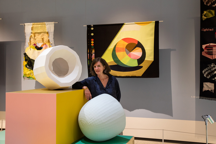
Perhaps the most intriguing theme in the space is Jongerius’ “colour catchers”; a series of three-dimensional objects that teach visitors about the endless capabilities of colour.
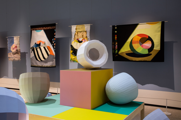
The patterned, cardboard structures in the shape of vases, pots and other day-to-day objects are littered throughout the exhibition, changing colour depending on how they are folded, the light that falls on them and the material and shade of whatever is near them.
The colour catchers play with the visitor’s eye, showing how objects are not always what they seem. Some are entirely grey, but appear as red, pink and blue thanks to the bright lighting and coloured platforms they are sat on.
Rather than being constructed as nameless shapes, they have been sculpted as recognisable items to “help people relate an abstract theory to things that are practical to their homes and lives”, says Newson.
This phenomenon is one that relates to real life. It was only a few years ago that a dress went viral on Twitter due to people’s mixed opinions on whether it was “white and gold” or “black and blue”; an example of people’s differing perceptions of colours, and also how much the debate intrigued people.

Jongerius’ cute, folded structures are a plea to think more subjectively, aimed at paint companies, designers and consumers alike.
“As designers, we can only buy what the paint industry makes,” says Jongerius. “I would like to buy colours that breathe and react with the light, and which are not stable. We may sit behind a computer or look at our phones all day, but we still live in a physical world and the colours we use should be the highest quality. Tactility is very important.”
The overall aim of the show is not to lecture visitors about science, theory and definitions of colour and light, says Newson, but to enable them to see the world differently.
“My favourite thing in the exhibition isn’t in the exhibition at all,” he says. “It’s what happens when you leave. It’s seeing that complex variety of colours within objects for the first time.
“Look at black and white – one is the absence of colour, and the other is the presence of all colour,” he adds. “It doesn’t matter whether you call it light, colour or shades. This whole show is just about individuals’ personal responses.”
Breathing Colour by Hella Jongerius runs 28 June – 24 September 2017 at the Design Museum, 224-238 Kensington High Street, Kensington, London W8 6AG. Tickets are priced at £4.75-£9.50. For more information, head to the Design Museum’s site.
Read this next


I hope some day more artists and creatives will commit to learning more about colorimetry and how color systems and notations actually work before they criticize. For example, Dulux color notations are nothing like a Pantone color number. It’s a bad comparison and smacks of uninformed.
Ok. So, you edited the article and changed Dulux to NCS and it didn’t help. Pantone is not a color order system; it’s a color matching system. NCS and Dulux’s The Master Palette are color order systems whose color notations define and describe color.
If you have to throw shade at the science of color in order to validate the art of color, then that indicates a fundamental lack of understanding about how humans perceive color and likewise how colorimetry can quantify it.
Hi Lori,
Thanks for your comments. We amended the article as NCS and Pantone both use a prescribed system and were mentioned by the curator of the exhibition. According to the curator, the overall gist of the show is to challenge systems such as these, and that’s what we have tried to convey.
Thanks,
Design Week team
Beautiful exhibit! It shows how much color is experiential in everything from art to cars to wall color. The most successful colors are those that evoke emotion.
NCS and Pantone do not use a “prescribed system”. Not even sure what that’s supposed to mean exactly but I’m going to let it go.
As one of my colleagues mentioned, the artistic concept has loads of merit in its own right and it’s unfortunate they felt the need to disparage other approaches to color in order to make their point – really not necessary.
And it’s ironic that artificial lighting that simulates morning, noon, and evening is at the heart of this exhibit. Gosh, I wonder how the lighting designers were able to calculate the illuminants critical to creating the different color experiences at every turn throughout the exhibit. I’ll bet you a brand new Pantone Bridge fandeck that it was some sort of “prescribed system” that measures, orders and notates light and color. 😉