Hope to Nope: the exhibition exploring the power of graphics in politics and protest
The Design Museum’s new show delves into the last 10 years of turbulent political events, and reveals how design has played a role in persuading, uniting and angering the public.
Over the last 10 years, political protest has become more and more frequent all over the world. Donald Trump’s election; the Brexit vote; austerity, the refugee crisis and the state of the NHS; gender inequality and sexual harassment; all these issues and more, have seen an uprising of public dissent that has led to very creative portrayals of anger and dissatisfaction.
Graphics, illustration, art and poetry has increasingly been used in clever ways to express opinion. Professional illustrators, designers and the public have taken part in this, as graphic protest has become democratised; from the professional realms of Shepard Fairey’s ubiquitous Barack Obama “Hope” poster, through to a satirical reinterpretation of this in the form of the Donald Trump “Nope” poster, and the Pussyhat project started in the name of women’s rights, which saw thousands of people knit their very own pink, woolly hat in solidarity.

Of course, graphic design has not only been used by those protesting Governments. Those in charge have also used design in one form or another as a means of persuasion or an assertion of power, with everything from Michael Bierut’s carefully-thought out presidential campaign for Hillary Clinton through to the controversial Brexit bus promising the public “£350 million” more for the NHS should the UK choose to leave the European Union (EU).
Political design is all around us. Plus, with the fast-paced nature of news today, and the ability to receive 24-hour updates via apps, social media and online live feeds, the act of protest is constantly evolving.
Social media has transformed the way that we come together and unite, one pertinent example being the #metoo campaign, which started as a Twitter hashtag allowing people to speak out about sexual harassment, and exploded into a global phenomenon.

A new exhibition at the Design Museum looks at the rise of political activism and protest art over the last 10 years, starting in 2008, the year of the financial crisis. The financial crash saw unemployment and general economic instability ensue, and was a trigger for much of the public dissent and political volatility that has arisen over the last decade.
Hope to Nope: Graphics and Politics 2008-18 has been curated by the Design Museum’s Margaret Cubbage, alongside Lucienne Roberts and David Shaw from independent publisher GraphicDesign&. Roberts is also founder at LucienneRoberts+, the studio that has completed the graphic design for the exhibition.
The space has been split into three sections – power, protest and personality – with a large graphic timeline running the whole way through the gallery, marking key political events of the last 10 years and documenting the role of new technologies such as social media.
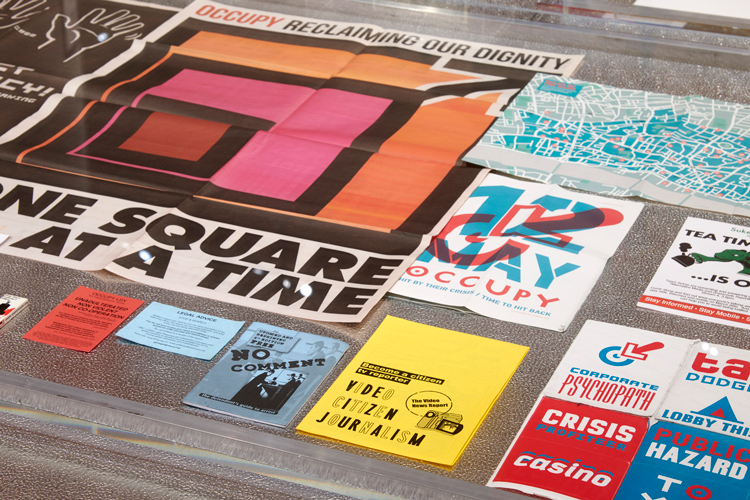
The exhibition’s sections are simple – Power looks at the establishment, Protest looks at the people and Personality explores the rise of celebrity status and a focus on the personality of politicians. Prints, posters, branding, illustrations, newspapers, magazines, digital renders, objects and more cover the walls of the space.
The show does not aim to take a political stand-point or view, says Lucienne Roberts, founder at LucienneRoberts+, but instead represent both sides of the story and look at political graphics from different angles.
“We’ve tried to be as impartial and inclusive as we can be,” she says. “What’s interesting is looking at graphics from top-down, so the establishment, and bottom-up, the people. We wanted to distinguish what the differences are, and look at how graphics has become a way of giving people a voice.”
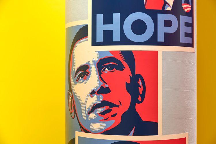
In more detail, Power explores how Governments have used graphic design to persuade the public and assert their authority. Well-known exhibits include the aforementioned Clinton presidential campaign, the pro-leave and pro-remain Brexit campaigns, and propaganda posters from North Korea.
This is followed by activists’ attempts to subvert, mock and change these campaigns, such as a redrawn logo for oil and gas company BP that comments on the Deepwater Horizon oil spill of 2010, commissioned by Greenpeace, and a controversial swastika symbol that was edited to symbolise Trump’s right-wing views.
Protest is the largest section, featuring designs created and used by protesters, particularly on the streets, including everything from the Pussyhat campaign, to the three billboards response to the Grenfell Tower fire in London and graphics used on the Je Suis Charlie marches in Paris in 2015 following the terrorist attack on the Charlie Hebdo magazine office.
Roberts says that this section was the most crucial as the aim of the show is to represent communities and show how this is happening all over the world.
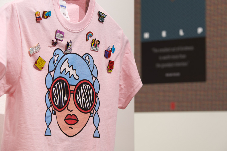
“We wanted to make it as international as it could be, and represent voices that not everyone would be familiar with,” she says. “Yes, Clinton, Brexit campaigns, the big women’s marches are all there too, but representation was more important.”
Free speech and action may be taken for granted as an innate right in Western democracies such as in the UK and US, but in many countries, these things are not so readily available. The exhibition aims to show how, in places such as North Korea and Syria, protest is perilous and potentially life-threatening.
“We include the work of a group of feminists in China, who wanted to run a campaign to stop sexual harassment, particularly on public transport,” says Roberts. “The Government tried to stop her, so in the end she had to get on a tube train, hold a poster up, and get off again. Using graphic design as a tool for protest is dangerous and very brave for some people.”
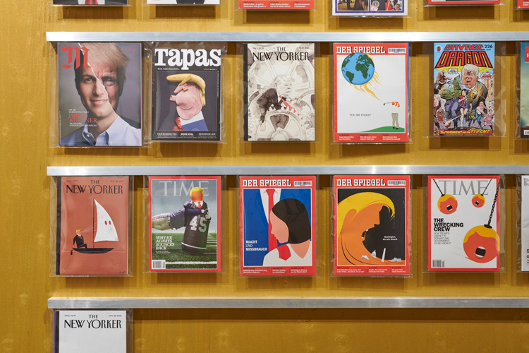
The last section, Personality, looks at how political figures have been portrayed graphically, and in some cases, have become instantly recognisable even by the most minimal illustration. Most of us have probably seen an illustration of Labour Party leader Jeremy Corbyn “dabbing”, while Trump’s blonde quiff has become an instant signifier for the president.
“There is a whole wall dedicated to illustrative images of Trump,” says Roberts. “We were struck by how he’s become such a graphic icon. You can use one element of him, and you’ll know that it’s him. Illustrators have been very imaginative.”
Though printed materials such as posters and banners dominate the exhibition space, it also examines the use of digital means of political campaigning, such as through social media. The rise of tech is not only looked at as a positive means of garnering public unity and support, but also a frightening breach of privacy. The community aspect of the #metoo campaign is countered by the recent revelations about Cambridge Analytica allegedly using people’s Facebook data to produce advertising to target and persuade US voters.
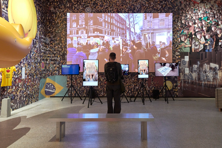
“Tech’s story isn’t just about democratising things or allowing protesters to coalesce more effectively,” says Roberts. “It’s also about surveillance.”
In terms of exhibition design, LucienneRoberts+ has worked on the two-dimensional (2D) graphic design, and Dyvik Kahlen Architects has completed three-dimensional (3D) design. The aim was to portray a “chaotic” space.
The walls feature moving, lit-up signage and large, colourful quotes from activists and designers, alongside floor graphics, with a look that aims to be “rough and ready” and represent the act of fly-postering, rather than “precious” and tidy, says Roberts.
Posters and stickers have been used for labels and introductory text for the exhibits alongside fluorescent colour palettes. The messy design looks to contrast with the “logical approach” to structure and sections, which aim to make navigating the space easy.
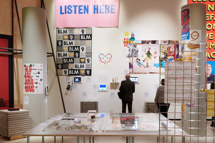
“We’ve erred more to the visually busy, strident style of design,” says Roberts. “The chaos suits the subject matter and materials – none of it is quiet, it’s all about who shouts the loudest.”
The “chaotic” design has been thrown together in such a way that it would be possible to add signs on the walls for new exhibits that might be included later – this was crucial, given the fast-moving nature of the subject matter, which is so tied with the constant flurry of news.
“We’ve left enough space to add more to the exhibition, such as with the wall of Trump magazine covers,” says Roberts. “The space is easy to update, so if something major happens, we’ll have a meeting and decide what to do. We have to be responsive.”
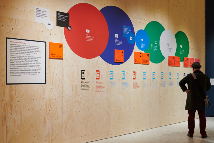
Perhaps the most striking aspect of the space is a big plywood wall designed by Dyvik Kahlen Architects that traverses it, dividing the sections. While Roberts does not mention Trump’s proposed plans to physically separate the US from Mexico, the object has become so synonymous with this idea that it is impossible not to see this as a strikingly obvious symbol for his presidency, as it serves as a “barricade” across the space, she says.
The fact that the design aims to be “rough and ready” and not “precious” bodes well with the content. The main section of the exhibition represents how graphics and illustration has become truly democratised in protest, opening the discipline up to politicians and the public alike, alongside professional designers and illustrators. On the same lines, Roberts makes the point that much of this design did not have to be perfect or aesthetically pleasing to be effective.

“We don’t think the pro-Brexit bus was beautiful, but that’s not the point,” she says. “It was designed. The fact that it might not have been to our tastes is beside the point.”
And while the exhibition itself looks to take no political sides in the show, Roberts hope people will leave it feeling not only that they have learnt more about the events of the last decade, both harrowing and uplifting, but also that they have recognised the power graphics can have and the impression it can make on the masses.
“With this show, there was a borderline between feeling overwhelming, depressed, and empowered,” she says. “I’m hoping for the latter.”
Hope to Nope: Graphics and Politics 2008-18 takes place 28 March – 12 August 2018 at the Design Museum, 224-238 Kensington High Street, Kensington, London W8 6AG. Tickets cost £12 full-price and £9 for concessions. The exhibition will be accompanied by an exhibition book, and a public talks programme. For more details, head here.


All leftist protest and talking points given prominence I see. Good job Design Museum (or massively biased photographer for CR) for ignoring the other side of the conversation. Or was that the point?