Spiekermann heads up tour to underline typefaces
Next week sees the launch of a five-day tour of the UK by type guru Erik Spiekermann, in an event organised by the International Society of Typographic Designers called Kern Up The Volume. Spiekermann will be joined by Derek Birdsall and Why Not Associate
Next week sees the launch of a five-day tour of the UK by type guru Erik Spiekermann, in an event organised by the International Society of Typographic Designers called Kern Up The Volume. Spiekermann will be joined by Derek Birdsall and Why Not Associates founder Andy Altmann for the London leg of the event, to host talks and discussions tackling issues facing the typographic industry.
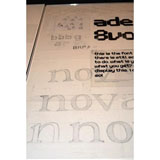
The tour kicks off at the University of Ulster, Belfast, on 30 October and then travels to Glasgow, Manchester, Bristol and London. ‘We are trying to bring typography to people fresh, to show how important it is to graphic design. Unfortunately, there is a bit of a slide into mediocrity from current student work and we have lost some of the great tutors with typographic skills, such as Alan Fletcher,’ says ISTD president Freda Sack.
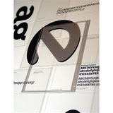
At the same time, the Typographic Circle last week launched its season of events, hosting an exhibition of the Type Directors Club’s 52nd awards winners, and type design consultancy Dalton Maag is showcasing 15 years of work.
One of the emerging challenges for type designers – and, by extension, brand managers – is the development of typefaces that are legible and consistent on the small, low-resolution screens of mobile phones. To address this, font foundry Monotype Imaging has unveiled a set of typefaces developed specifically for mobile phone screens in a bid to offer greater flexibility to designers.
The company, which became one of the largest type libraries in the world when it acquired Linotype this summer (DW 10 August), is looking to capitalise on the use of mobile phones as a marketing medium, by enabling designers to create greater brand consistency on hand-held devices.
Monotype has developed a catalogue of more than 200 fonts, called ESQ Mobile Fonts, which it claims is the first mobile-dedicated font set. The typefaces are specially tuned, or ‘hinted’, to be rendered with ‘enhanced screen quality’ on mobile displays, which are much lower resolution than computer screens.
‘We have been trying to build an awareness of type for mobile for the past five or six years to make it possible for designers to be much more flexible. Previously, it was very limited, with basically only two fonts available,’ says Julie Strawson, European marketing director for Monotype Imaging. ‘Initially for handset manufacturers and user-interface developers, but then brand owners too, the fonts are a way to differentiate their products,’ she adds.
She claims that businesses will increasingly channel branded messages through opt-in mobile content, but, unlike advertising, these are likely to be personalised, based on information specific to the user. ‘Companies want to ensure that their brand integrity and corporate identity is maintained visually [in this content],’ she says.
Before the launch of the ESQ collection, Monotype contacted branding and design consultancies to discuss designers’ requirements in developing mobile content. ‘We talked to them in a “futures briefing” and found that many groups want to design mobile content, but don’t know how to do it,’ adds Strawson.
FACE THE FUTURE:
• Monotype Imaging launches 200 fonts designed for mobile devices
• ISTD hosts five-day UK tour discussing typographic issues, headed by Erik Spiekermann – more information at www.istd.org.uk
• Dalton Maag launches Speak to Me, a 15-year retrospective of its type designs – 20 October to 2 November at ad agency Leagas Delaney in London
• Typographic Circle launches events season with Type Directors Club exhibition at ad agency JWT in London, running from 19 to 31 October
Read this next

-
Post a comment


