Wider circles
Lance Wyman created an enduring classic in his simple, geometric design for the 1968 Mexico Olympics, and offers some valuable advice to London 2012 Olympics designers. Emma Booty finds out what keeps him motivated and why he has broadened his scope to in
Lance Wyman created an enduring classic in his simple, geometric design for the 1968 Mexico Olympics, and offers some valuable advice to London 2012 Olympics designers. Emma Booty finds out what keeps him motivated and why he has broadened his scope to include city wayfinding systems
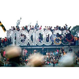
AS a 29-year-old designer working on the visual identity programme for the Olympic Games in Mexico in 1968, Lance Wyman would have had no idea of the lasting impact this work would have. Its originality, elegance and verve changed the world’s view of contemporary Mexico. Since then he has continued to conceive long-lasting and resonant design and wayfinding systems, combining storytelling with uncompromised functionality, which become knitted into the fabric of cities and communities.
For pure graphic pleasure, look at the hippopotamus pictogram for the National Zoo, discover the Blackfoot teepee circles and white Stetsons for Calgary +15, the irreverence of the colliding LG Arts Centre logo and the integration of architecture and signs with Marco.
Emma Booty: It would be impossible to interview you without mentioning your involvement with the 1968 Mexico Olympics. You must get asked to talk about it a lot. How does this feel?
Lance Wyman: It’s wonderful because it was a long time ago. It’s hung in there. A programme that people are talking about each time the Olympics come about, I love it. It’s a refuelling process every four years.
EB: Why do you think it has endured for so long?
LW: Probably because it was so related to the time. It was the Op Art time – it had a vibration with the culture and with the time of those games, that’s what stuck.
EB: But it still looks relevant.
LW: It’s pretty basic geometry, isn’t it? It is pretty pure and you have to say that about the Olympic rings too, because that was the genesis of the logotype.
EB: What was the influence of pre-Hispanic art?
LW: The Huichol Indians used to, and still do use coloured wool that is placed into a board of wax. They’re working with coloured line, and the way this line works became such a huge influence as far as the colour of the games in Mexico was concerned. We had a lineal structure and by just changing colour we were able to have an effective branding programme and create an atmosphere correct for Mexico. It is a very colourful culture.
EB: What advice would you give the designers and teams working on the London 2012 programme?
LW: From experience in Mexico, and looking at some recent Olympics since, being really clear about having a sense of place is crucial, and that’s even more important now that we are becoming global. Otherwise, it becomes just another international event.
Having said that, I think the biggest thing is that there’s such a mix of layers. You have the commercial part that is extremely integrated now with the games, you have big productions with the opening and closing ceremonies, and they all become a bit confusing – it’s harder to have clarity.
One of the strengths that we had in Mexico was that it was run almost like a dictatorship, but then we only had 18 months to do it. Otl Aicher, who designed the 1972 Munich Olympics, came through and said, ‘We’re further ahead than you are’, even though their event was another four years down the road.
EB: The Olympic spirit – how do you temper that into the mix?
LW: The best thing you can do, when you invite people to visit you, is to be as hospitable as possible – ‘Come to my home and have a good time.’ It strikes a chord. [People think], ‘that’s true, I feel it’.
EB: When designing wayfinding systems for cities, it is often part of the regeneration of a run-down area. Does it ever feel like you are just painting over the cracks?
LW: Not really, because it certainly doesn’t do that. In fact, it’s even harder to get it to be seen because of the cracks, and you have to coexist with all of those other cracks too. One of the realities about putting things into a city – an ongoing, living environment – is that if it’s not really taken in, no matter how much it is maintained, the first chance it has for change it will change, and that’s to do with the politics of organisations and the attitude of people in the street. But they have the potential to become part of the character of a city – to have a much bigger existence – and when you see your stuff getting used, it’s a wonderful feeling. I like to get off on design being appreciated by designers and getting all the accolades. Who doesn’t like that? But there’s another level where something is going on that is extremely rewarding. I just feel so thankful to have had this experience.
EB: These strands you create are starting points, but they live on and, for me, this really typifies the type of work that you do. This integrated use of design is very fundamental. What do you think makes your work different?
LW: Einstein said, ‘Everything should be made as simple as possible, but not simpler.’ I guess it’s the ‘not simpler’ part that is the real challenge. It’s easy to do simple, geometric things, but for it to have a motion, a story, an expression or relationship to something that people get – well, that’s powerful and I’ve always tried to do that.
Lance Wyman gives a D&AD President’s Lecture on 22 November at the Logan Hall, Institute of Education, 20 Bedford Way, London WC1
-
Post a comment


