More bottle for Glenrothes whisky
Holmes & Marchant international has redesigned packaging for Scottish malt whisky Glenrothes, which has an international relaunch in July followed by a relaunch in the US two months later.
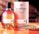
Holmes & Marchant international has redesigned packaging for Scottish malt whisky Glenrothes, which has an international relaunch in July followed by a relaunch in the US two months later.
The project, which is worth £60 000 in design fees, involved the creation of two different packaging systems, one for the international market, including its principle territory Spain, and the other for the US.
Both packs are a departure from the “boring, sedate” cardboard tube that concealed the bottle from view. “There is definitely a status associated with the bottle,” according to Holmes & Marchant International structural design director Jon Davies.
The pack features a cast aluminium base which supports the bottle within a cardboard frame. The base reflects in-store lighting upwards into the bottle, creating increased stand-out on shelf.
“We felt that it was imperative to present the bottle to the customer, making the bottle the icon of the brand.
“We used standard materials that are available at the manufacturers – corrugated cardboard, strapping found on pallets, metal stamps – as inspiration for the whisky packaging,” according to Davies.
“The brand in the US is very much a fashion item and is sold in ‘style bars’. The client (Cutty Sark) wanted a pack that reflected the trendier, younger audience in the US. We took the glass and metal architectural feel of the bars and applied it to the packaging,” adds Davies.
Cutty Sark International refused to comment on any aspect of the packaging.
The consultancy won the work without a pitch.
Cutty Sark is the Scotch whisky division of wine merchant Berry Bros & Rudd.
Read this next

-
Post a comment


