More than words
To stave off competition from digital media, publishers are using ever more eye-catching packaging to persuade image-conscious consumers to buy their books. Yolanda Zappaterra flicks through some latest examples of this trend
Why do we still buy books? When it’s easier, cheaper and quicker to access any information we could possibly want on-line, what’s the point of owning heavy, expensive, non-searchable items that require care and consideration? It’s obviously a question that book publishers of all kinds – from independent graphic novel publishers to the big art houses – have to grapple with in their battle to keep us buying books, and it’s an area that offers designers lots of exciting possibilities. The publisher’s ability to position books as desirable objects is key to the public’s continuing consumption of them, so their packaging and design becomes ever more important. As Thames & Hudson design editor Lucas Dietrich explains, ‘In the context of the bookstore, 99 per cent of whose books are conventionally presented, the “package” becomes an object of design in its own right. The heightened stature gives added value to the buyer, which is important in a world where image is key.’
Graphic novel publisher Top Shelf Books is also aware of this ‘added value’ stature, and is increasingly applying it to important publications, in a bid to match standards set by European graphic novel publishers, such as French manga master Delcourt. ‘There’s a new bar for exquisite packaging [in graphic novels], the “Absolute Edition” style, which is just catching up with the great European oversized hardcovers collections,’ he explains. German publisher Taschen has long been an exponent of this oversized ‘absolute editions’ approach to publishing, and its latest offering, a David LaChapelle monograph entitled Artists & Prostitutes, pushes the envelope further.
There’s always a danger that such publishing behemoths are little more than exercises in marketing, but with care and a good design strategy, unusual and luxurious packaging of a book can add to its aesthetic and concept. In the case of Tank magazine anthology Tank Too, for example, Dietrich says, ‘It’s clear that the packaging is an ironic statement on the signature staple of the fashion world. At the same time, the idea emphasises the book’s three-dimensionality – a door-stopper packed with visual inspiration.’
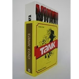
Tank Too, by Masoud Golsorkhi and Anfreas Laefer, published by Thames & Hudson, packaged in a ‘matchbox’ slipcase, £19.95. Design by Masoud Golsorkhi (pictured top)
A second anthology of Tank magazine, containing four years of the cutting-edge photography the magazine specialises in, required a packaging solution that would be as irreverent and stylish as the product itself. Masoud Golsorkhi, founder of Tank, came up with the concept for the matchbox, which was designed in-house at Tank to align it with the original packaging for Tank one, a cigarette pack. When the book is pulled out of its slipcase, it reveals a line of red-stilettoed legs in black tights that resemble matches. The concept was arrived at as ‘a familiar object re-rendered. It’s the Freudian thing about always falling in love with the same woman (your mum), but in new guises. I remember those big boxes of matches as a child – they feel warm. They have to do with eating and a comforting setting,’ says Golsorkhi.
Phaidon Design Classics, published by Phaidon. Three hardback volumes in a case designed by Konstantin Grcic, £99. Book designed by Hoop Design
While Phaidon’s recent publication of this massive design project is to be applauded, the case isn’t. It is virtually impossible to open without breaking something (the case itself or a handful of fingernails at least), Konstantin Grcic’s black plastic case frustrates, infuriates and ultimately undermines the message of the publication. Unless it’s supposed to make you think about what makes good and bad design, in which case it’s inspired.
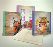
Lost Girls by Alan Moore and Melinda Gebbie, published by Top Shelf Productions as three oversized (23 x 30cm) clothbound hardcover volumes, shrink-wrapped in a slipcase. $150 (£81) signed and numbered edition, limited to 500 copies, $75 (£41) unsigned. Design by Brett Warnock and Matt Kindt
In deciding to publish Lost Girls in a deluxe edition, Top Shelf is following a growing trend towards luxurious packaging and limited editions in graphic novel publishing, but, in this instance, the authors dictated the direction of the packaging. ‘We considered many options, but this is the route that Alan and Melinda really had their heart on, and so it made our decision very easy, says co-publisher Brett Warnock. With the signed and numbered edition, Top Shelf hopes to recoup some of the close-to $200 000 (£108 600) first print run.
David LaChapelle, Artists & Prostitutes, published by Taschen. Limited edition of 2500 copies worldwide, signed and numbered by David LaChapelle, £850. Book and box designed by David LaChapelle together with Taschen’s in-house team
This is more like it. You get big ideas for your big bucks with Taschen, and no more so than when the book is a 700-page XXL format (34.5 x 50cm) hardcover in a cloth-covered presentation box, featuring the kind of sumptuous printing needed to do justice to LaChapelle’s photography. With hundreds of the world’s most famous people captured in full-bleed images, reproduced in Pan4C, to produce an intensity of colour, £850 seems a small price to pay for something stunning and surreal enough to decorate your Josef Albers nesting tables (£999).
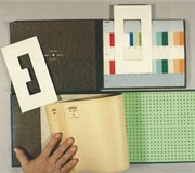
Le Corbusier Polychromie Architecturale/ Colour Keyboards from 1931 and 1959 by Arthur Rüegg. Published by Birkhauser. Three volumes in clothbound slipcase with hand-coloured cards and sample sheets, $400 (£217). Design by Le Corbusier
This beautiful book, detailing and containing the colour palette designed by Le Corbusier for wallpaper manufacturer Salubra, perfectly marries the need to deliver information with the need to create desirability. The publication recreates the original project conceived by Le Corbusier as different tones on sample cards, so that three to five colours could be isolated or combined using a sliding band to produce a different colour atmosphere and a specific spatial effect. Complete with hand-painted colour charts and a cloth slipcase that does real justice to the contents, it is worth every one of the $400 (£217) it retails at – something that too rarely applies to luxury packaging.
-
Post a comment


