
Design inspiration: the best projects from January
Pentagram’s rebrand of an internet password system, an adult-targeted CBD drink and a smart watch are some of our favourite projects from the past month.
Rebrand: Dashlane, by Pentagram New York

Dashlane promises “radically easier internet” by letting people autofill passwords so that they can “dash” through the internet. To accompany that vision, Pentagram’s Eddie Opara (partner at the New York office) rebranded the company with a design system based around a sign called the AroundRects, which resembles a dash sign. The simple form aims to conjure “lanes on a highway, gesturing towards freedom of information and exploration”. The identity now has an updated colour palette too; predominantly a deep blue-green tone called Dash Green, as well as lighter shades of pink, orange and red. A new typeface, Walsheim, has also been picked – all in an attempt to create a streamlined, uncluttered identity. To kick things off, Dashlane unveiled an advert to promote the new identity at this weekend’s SuperBowl, featuring the grim reaper.
Packaging: Common Water, by The Clerkenwell Brothers

The CBD trend shows no signs of stopping, and the latest product is Common Water, which aims to provide a simple and effective way of consuming CBD through liquid. A streamlined, worm-like logo has been created for the visual identity, taking its cues from the luxury market while retaining a sense of intrigue about the product. The bottles are fully recyclable and also have UV-protection for the CBD inside, and dye has been used “sparingly”, according to the design studio. The “refined and restrained” identity aims to be an “antithesis to the hectic nature of modern life”.
Cards: These Cards Will Change Your Career, These Cards Will Change your Ideas

No ordinary deck of cards, these two sets from Lawrence King, promise to change your whole life. Or your career and ideas, anyway. The ‘Ideas’ set have been written by Nik Mahon is a senior teaching fellow at the University of Winchester School of Art and covers advertising, art direction, creativity and ideas generation. The ‘Career’ pack have been written by Gem Barton, whose book Don’t Get a Job… Make a Job focused on helping people get their careers back on track. Each set contains bite-sized but practical advice, and the bright, bold graphics should help you maintain January motivation through to the spring.
Poster: Montreux Jazz Festival, by JR
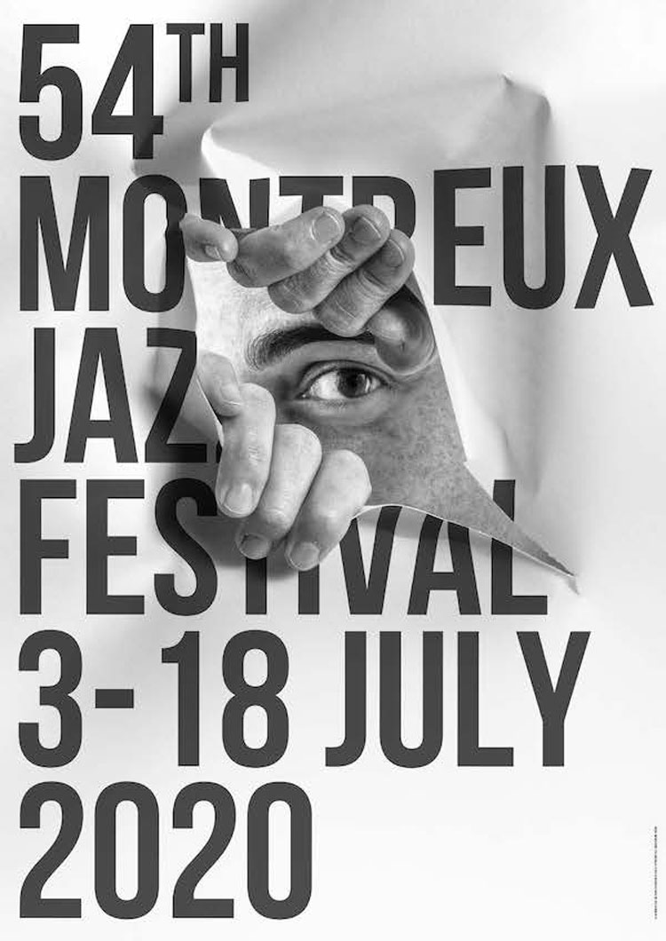
The poster for the 54th Montreux Jazz Festival has been designed by street artist JR (who previously created the photoshoot at Madonna’s 2018 Oscars Party). The jazz festival takes place in the summer in Switzerland, on the shore of Lake Geneva; past designers of the poster include Keith Haring (who designed three series of posters for the festival), David Bowie and Andy Warhol. JR’s take mixes eye-catching photograph, simple typography with a playful edge. It uses mise en abyme – that is, layering an image inside an image – to make it seem as though a man is peering through the torn poster himself. Whether or not it actually is JR will remain unknown; he is anonymous and never leaves any explanation behind his work.
Watch: Honor MagicWatch 2 design series

Smartphone company Honor unveiled a new limited-series watch, MagicWatch 2, with a series of designers including Jacky Tsai, George Greaves and Wang DongLing. The watch is fully customisable – users can personalise the watch face with their own designs, including with their own photos. The watch itself has a sporty look – and has a range of health and fitness features – though there are a range of straps to choose from which means it can be customised once again for different occasions. The different design collaborations are equally wide-ranging, from Pop Art-inspired (Jacky Tsai), an edgy graffiti look (Giovanni Ozzola) and a playful use of palm trees (from Bristol-based illustrator George Greaves).
Rebrand: Botify, by Omobono

SEO platform Botify has been rebranded with a look from London-based studio Omobono, which aims to help the company stand out from the “cliched design cues of Silicon Valley startups”. The logo is reminiscent of a search function icon – and acts as the o in the brand’s name. It can also spin when animated to mimic the actions of a radar tracking and finding objects.The purple tone was inspired by the shade links turn after they’ve been clicked on once; it’s also “completely ownable” in contrast to the “sea of blue and green hues” for similar companies, Omobono says. As a way to ground the tech company in something more material, paper has been used as part of the new visual identity – for images on the website, for example. “Paper embodies the simplicity of the brand, but it’s also a powerful metaphor for information and knowledge, as well as craft and quality,” the design studio says.
Installation: House of Dots, by Camille Walala

Camille Walala has collaborated with Lego to create the House of Dots, an immersive exhibition at Coal Drops Yards. It’s been created to introduce Lego’s new tile play concept, Lego Dots, which encourages self-expression for kids through a range of products – from wearables to interiors – from the toy company. House of Dots itself is spread over eight shipping containers, everything is Lego-themed, from the walls and floors to the rugs, remixed with Walala’s signature geometric style. To exit, there’s an 8-foot slide down one side of the installation.


Honestly, I think it’s this kind of stuff that puts people off
the notion of ‘design’! It’s design for designers. That is not a kitchen most people would enjoy or endure. It’s exhibitionism without much care for the user. And so fitting that it’s in Coal Drops Yard…only £4 for a designer cappuccino and no shoppers! Head in the clouds…yes, we need to dream…but with our feet on the ground if we want it to have any relevance.