Rhodes Trust looks to modernise with “21st century” rebrand
Brand consultancy Lambie-Nairn’s visual identity for the scholarship charity features a cleaner, more streamlined version of its original bird logo.
International scholarship charity Rhodes Trust has revealed a new visual identity by brand consultancy Lambie-Nairn.
The consultancy was briefed by the 114-year-old trust to reposition it as a “global”, “forward-thinking” scholarship programme for the “21st century”, says Lambie-Nairn.
“The previous brand focused too heavily on the past and did not reflect the academically excellent, determined and, above all ,conscientious students,” says the consultancy.
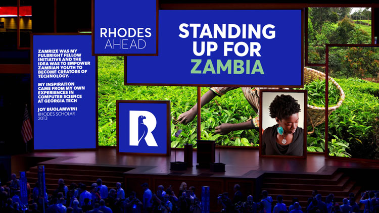
Lambie-Nairn’s new identity for the charity – which is based at the University of Oxford – is based around the idea of “standing up for the world”.
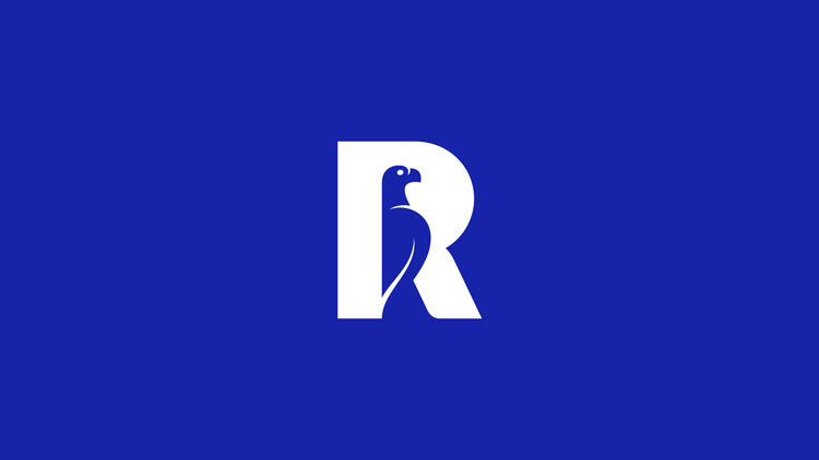
Bird symbol
An updated logo features a refined version of its existing symbol depicting a stone-carved Zimbabwe bird representing the country’s national emblem, which has been refined by typography artist Rob Clarke and appears in a brighter blue.
The bird symbol is now incorporated into the centre of the letter “R” seen within the logo.
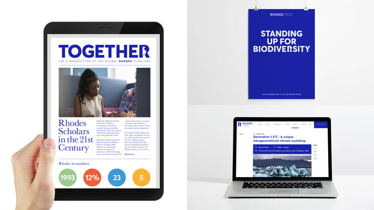
The “R” appears in bold throughout the identity so that it can be incorporated into “meaningful” words such as “democracy”, “human rights” and “biodiversity” as part of the trust’s new tone of voice, says Lambie-Nairn.
Sans-serif typeface Averta Standard appears in several different weights, and has been chosen for greater legibility when being read on smartphones, computers and tablets.
The new identity has now rolled out across all touchpoints.


-
Post a comment


