Zulver & Co unpacks Abels identity
Royal removal company Abels takes the wrappers off a Zulver & Co-designed corporate identity this week to suggest the brand is a cut above so-called ‘lift-it and shift-it’ operators.

Royal removal company Abels takes the wrappers off a Zulver & Co-designed corporate identity this week to suggest the brand is a cut above so-called ‘lift-it and shift-it’ operators.
The new logo is being added to the company’s fleet of vans and staff livery, as well as informing a style guide for brand marketing and advertising.
As the only holder of a royal warrant within its sector, Abels was anxious to maximise the visibility of the endorsement without infringing Buckingham Palace’s design guidelines, says acting sales and marketing director Peter Detre.
He adds, ‘[We were] also keen to adopt modern corporate visuals that differentiate us from the majority of old-fashioned looking removal operators.’
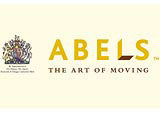
The identity shows the letter ‘L’ in Abels as a packing box along with the tagline ‘the art of moving’ – a device Zulver & Co design director Andrew Zulver believes will emphasise the company’s attention to detail and project its core business function.
Zulver adds, ‘A strategic review illustrated the powerful staff culture that exists within the business, such as strong business acumen and job pride. The challenge has been to communicate this powerful asset to potential customers through a new identity.’
The consultancy won the work, described as a ‘substantial five-figure’ contract, in November 2001 after a credentials pitch against two other unnamed groups.
-
Post a comment


