Form rebrands Live Union to show how it “facilitates connections”
Events company Live Union rebranded with “i” used as graphic device to show how connections are forged between stakeholders.
Form has created a new look for events company Live Union, which is based on connecting groups of people.
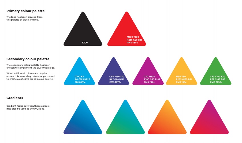
The consultancy based its new design around Live Union’s established black and red colour palette and has been inspired by the company’s ‘in-depth’ experience in ‘facilitating connections.’

The revamped logo abandons the previous serif wordmark, opting instead for a sans serif wordmark and a graphic device, which is designed to unite the two separate words featured in the company’s name.
Form creative director Paul West says: “The dot of the ‘I’ flips from ‘Live’ to ‘Union’ and unites the two words, illustrating in a subtle and smart way that Live Union facilitate connections.”
Secondary colour palette
The agency has also transformed Live Union’s visual identity across a range of communications. including the company’s website, style guide and credentials documents.
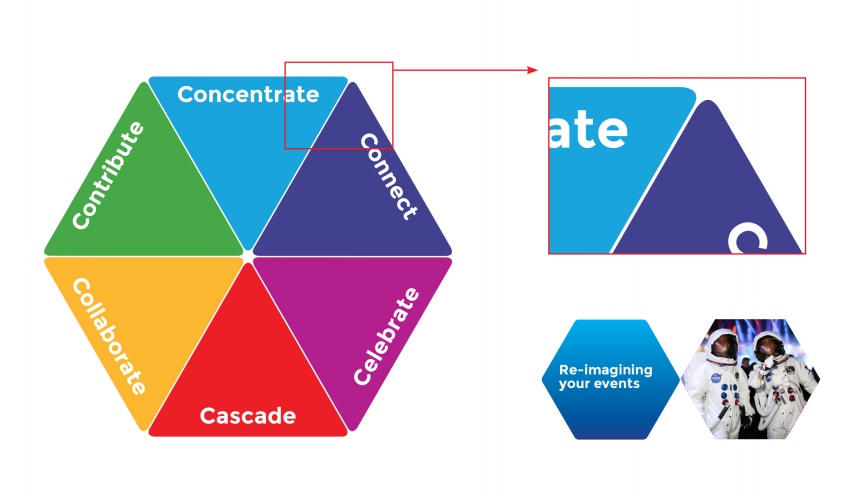
The idea was to create a ‘coherent visual identity’ by employing a hexagon shaped graphic, the ‘Delegate Value Proposition’, throughout several design elements.
The Delegate Value Proposition is used in presentations to convey Live Union’s objectives, and has been redesigned to include a vivid selection of colours within each section.
This same shape and colour scheme has been used as a holding device for key statements, quotes and images across the brand.
Form has also introduced a series of ‘corner clipped’ rectangles, which can be inverted and rotated for the same purpose.

Read this next

-
Post a comment


