
Management software Resource Guru rebrands to restore “harmony and balance”
Co&Co and Paraform have collaborated to modernise the scheduling app’s identity, which includes an updated guru logo and mystical illustrations.
Management software company Resource Guru has rebranded with the aim of modernising its personality while retaining a sense of “playfulness and magic”.
Created in collaboration with design studios Co&Co, Paraform and the company’s in-house team, the new branding includes a pared-back guru logo and bespoke set of illustrations. It rolls out across the website and app.

Resource Guru is designed to improve efficiency at work, with a software system that manages schedules and projects, as well as booking meeting rooms and project forecasting.
Co-founded in 2012 by Percy Stilwell and Andrew Rogoff, its clients include Nasa, Ikea and the NHS. “The time had come for our old guru to retire and tend to his vines in the Unkulunkulu mountains,” Stilwell says of the brand update.
“Sensitively” retiring the guru
Paraform co-founder Dean Wilson tells Design Week that the biggest task for the rebrand was working out how to “sensitively retire the guru cartoon character”.
While it was important to keep the former logo’s “playfulness and magic”, the lime green design was also bringing a “childish element” to the identity, Wilson says.

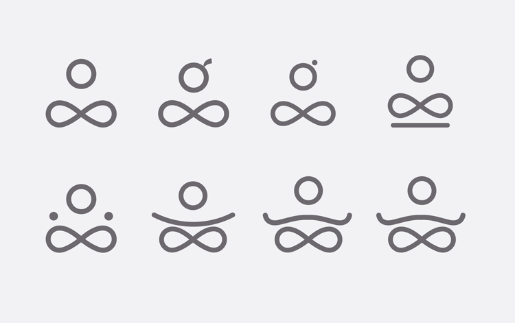
The pared-back logo is an attempt to maintain this spirit, Wilson adds. It evolved from attempts to create a “G” from the guru’s shape. The final design is a representation of the guru’s yoga pose.
The core set of geometric shapes illustrate “the brand principles of harmony and balance”, according to the designer. The crossed legs also form an infinity symbol which “represent the infinite nature of time”.
The guru’s head is represented by the third circle, while a top knot has been created from the final terminal in the wordmark’s “r”.

“Order from chaos”

Two typefaces have been added to the identity. Montserrat has been chosen for the website and blog because of its “geometric nature”, Stilwell says. Meanwhile, the “more functional” Lato has been used for the app as it remains legible at small sizes, he adds.
A varied colour palette is also now in use, featuring pinks, purples, greens and blues. In addition to this, illustrator Febin Raj has created a series of illustrations from the identity which depict locations both fantastical and urban. These visuals range from a pink-hued mountain scape to an infinity pool atop a skyscraper.
The team was familiar with Raj’s work, according to Stilwell. He adds: “We asked him to make the illustrations mystical, quirky and fantastical with rich deep colours and plenty of contrast.”
“Streamers” – colours converging into a single ray of light – have also been incorporated into the identity. They symbolise a principle of Resource Guru – “the concept of order form chaos,” Dean Wilson says. The visuals are displayed across the website’s backgrounds.
He adds: “The erratic nature of the lines that overlay and combine to form a singular beam of light represents the eclectic nature of employees in a company and their time being ordered into perfect harmony by Resource Guru.”
An “atomic” design system
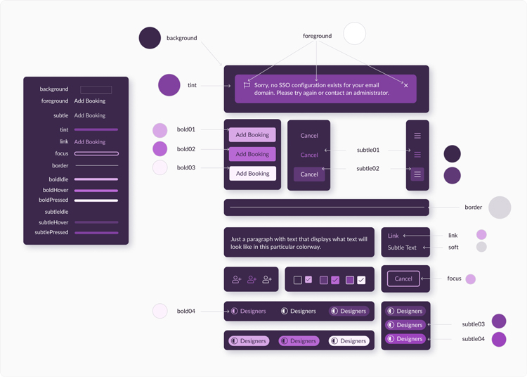
An “atomic” design system has been implemented with the aim of iterating and scaling the Resource Guru app more quickly and consistently, according to Wilson.
This series of building blocks has been created in software tool Figma and means that design components can be aligned more easily and kept in sync, he adds.
It also means that different themes can be adopted easily, Wilson says, such as the popular Dark Mode feature.

-
Post a comment


