Eye candy
When covers are this eye-catching you can’t help judging the book by its cover, says Pamela Buxton
According to Alan Fletcher, Pentagram co-founder and consultant art director at Phaidon, book design can be a ‘tortuous’ business. You have to get started on a ‘blad’ (short for ‘book layout and design’ – a taster for sales and marketing) before the book’s finished and there’s often little scope for commissioned imagery. It takes a really good designer, says Fletcher, to pull it off in spite of these difficulties.
Penguin Press, Phaidon and SteidlMack are three publishers that, in their very different ways, put design at the forefront. While Penguin Press does the majority of its design in-house, Phaidon commissions most out. Small art book publisher SteidlMack takes yet another approach, working collaboratively with the subjects of its books – artists or photographers – who are brought in as co-designers.
Penguin Press
Jim Stoddart should be very well read indeed. As art director at Penguin Press, he oversees the design of non-fiction, reference and classic fiction titles, including the Great Ideas series of writers, which ranges from Lucius Annaeus Seneca to George Orwell. But with some 30 titles a month to supervise, including some covers he designs himself, there’s not much time to spend digesting the content.
‘It’s a case of dipping in and getting a good flavour,’ says Stoddart, who has been in his current role at Penguin since September 2001.
Stoddart runs an in-house team of three, which designs about two-thirds of the titles, commissioning the rest from regular freelances and paying £500-1000 per cover. Generally experience shows, but, he adds: ‘A hugely experienced book designer can still make it look like their first [book].’
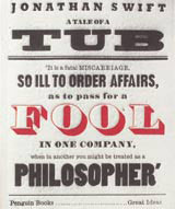
Penguin works nine to 12 months in advance, finalising the cover six months ahead of publication, at which point a third of design proposals are rejected. Non-visual subject matter is typically the biggest challenge, calling instead for a typographical or lateral approach. This worked brilliantly for the Great Ideas series, where each cover is given over to period decoration. Covers don’t even carry the famous Penguin logo, except Orwell’s Why I Write, a homage to the original Penguin cover, designed by Alistair Hall at We Made This. Most are purely typographical, such as Swift’s A Tale of a Tub, designed by David Pearson at Penguin, which emulates an 18th century poster. Designed mostly by Pearson, plus various freelance designers, the series earned the team a nomination for this year’s Design Museum Designer of the Year.
SteidlMack
SteidlMack, set up as the London imprint of German publisher Steidl, publishes artists’ books. In 90 per cent of cases, its beautifully produced books are designed in close collaboration with the artists themselves, says managing director Michael Mack.
‘The voice of the artist is very important,’ Mack explains. ‘Most artists have a clear idea of what they want, not just as a catalogue of their work but as a piece of work in its own right.’
SteidlMack publishes around five titles a year, with Mack and in-house designer Catherine Lutman working closely with the artists. Mack says the publisher tends to keep things simple, so the design ‘doesn’t outweigh the imagery’.
It’s an approach that won the duo a D&AD Silver last year for American Night, a book by photographer Paul Graham about the unseen in American life. Picking up on this theme, text is just printed in varnish, only visible in a certain light. Initially, the artist was unhappy with the results, so they overprinted the text to improve legibility.
SteidlMack does occasionally work with external designers – photographer Julian Germain’s book For Every Minute You Are Angry You Lose Sixty Seconds of Happiness was designed by Why Not Associates at the behest of Germain. While Germain determined the sequence of photographs of elderly subject Charlie Snelling, Why Not came up with the cover concept, using a floral design taken from Snelling’s home.
For his forthcoming book The Floating World: Ukiyo-e, John Warwicker, co-founder of Tomato, designed all the layouts himself. Despite its title, the book is a self-authored monograph, designed to highlight Warwicker as an artist in his own right.
But generally, Mack, a former lawyer, is closely involved as editor and co-designer. For him it’s clearly a labour of love, as the artists often require careful handling. But then, says Mack, ‘That’s the pleasure.’
Phaidon
With an extraordinary pleated cover and a stitched belly band, Sample, Phaidon’s upcoming survey of new fashion talent, is no ordinary book. But then Phaidon, the international visual arts publisher, takes an unusual approach when it comes to design.
For more than ten years Pentagram co-founder and renowned graphic designer Alan Fletcher has been working once a week at Phaidon’s London office, overseeing commissioning and progress. The London office has a design manager, Sonya Dyakova, but most books are designed out of house. Unusually, Sample, published in June, is designed by Julia Hasting, head of design in Phaidon’s New York office.
Fletcher’s close relationship with Phaidon is probably unique in book publishing. For him, it’s a hugely enjoyable process; for Phaidon, the close attention to quality editorial design has helped the rejuvenation of a company that was bought out of receivership in 1990. ‘There’s an aura of quality about [the books]. The striving for quality is very high, much higher than any other publisher,’ claims Fletcher.
Now it also has a reputation for innovative formats – last year it came up with the large-format atlas of contemporary architecture and this year it is condensing that into a travel version. Recently, it has diversified into postcards, such as the 100 Maverick and Che Guevara postcards.
Fletcher is always looking for new talent, though he also commissions established designers, including other Pentagram designers past and present. But the low design fees in publishing can be a deciding factor. ‘Books are done for love. It falls to people who’ve just started out who want a book in their portfolio,’ Fletcher explains.
It’s all a matter of matching the right designer with the right book – Sample, he says, was perfect for someone with an unconventional approach. Hasting produced a handmade dummy of the pleated and belted book and then found a way of getting it manufactured.
Fletcher also tries to avoid designing the books himself, because he feels it compromises his position as arbiter. But sometimes he can’t quite resist it – he designed the best-selling Art Book and is currently working on a three volume set on design classics.
Read this next

-
Post a comment


