Provident Financial
Design: Bamber Forsyth
Design: Bamber Forsyth
Photography: Arnhel de Serra, Simon McComb, Liam Bailey
Printer: The Colourhouse
The Provident Financial 2000 annual report uses a graphic vernacular, more readily associated with magazines than accounting, to put over its core message. ‘[Provident Financial] delivers a real service that is part of daily life,’ explains Bamber Forsyth creative director Keith Bamber. ‘We wanted to produce something no-nonsense that tells it like it is. It’s very confident and unapologetic.’
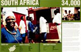
The journalistic feel of the report owes much to high-contrast reportage photography by Arnhel de Serra, Simon McComb and Liam Bailey. The vast majority of the shots feature real people going about their daily business – except in the UK, where clearance can be an issue. In addition, Bamber adopted a ‘typographic hierarchy’ similar to that of a newspaper, with headlines, standfirsts, body copy and crossheads. ‘It had to cater for the “scan reader”, as well as the “in-depth reader”,’ he explains.
Having enjoyed an eight-year relationship with Provident Financial, Bamber points to the importance of developing a coherent theme for each new report – this year’s being the increasing international scope of the company. The opening headline, which begins on the front cover and carries on to the first inside spread, reads ‘Helping households in Prague & Petersburg, Gdansk & Glasgow’, and the imagery globetrots from South Africa, to Poland, to the UK. ‘A good report should be communication-led.’ According to Bamber, ‘The words and pictures should be saying the same thing, there should be an idea in there, and it should be appropriate to the company values in its style.’
-
Post a comment


