Premature imagination
Robert Brownjohn’s decadent, ‘live-fast, die-young’ approach should have made him notorious, yet he is still relatively unknown. But, says Michael Johnson, while Brownjohn’s career may have been short and sweet, his classic work had a lasting impact and its influence is still apparent 40 years on
My guess is that most of you have never heard of Robert Brownjohn. Yet, to those who knew him personally, or know his work, he has attained a mythical, almost legendary status that might puzzle non-believers. His was a live-fast, die-(relatively) young tale, that left stories of his unhinged lifestyle – but not a vast archive of work.
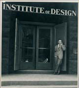
Until now, it has taken some serious graphic archaeology to unearth his work/ type-spotters, with back copies of Typographica, would have been aware of him as part of New York hot-shop Brownjohn, Chermayeff and Geismar; D&AD archivists would know his award-winning James Bond titles, where he projected type and images over a nubile young accomplice; Eye magazine drew attention to him by dedicating a large chunk of one issue to him, 14 years ago.
Other than that, there’s not a lot to go on. So where does his influence stem from and is it justified?
Absolutely. Brownjohn’s influence is everywhere. His reductionist approach still permeates our graphic landscape 40 years on. His work is a fantastic antidote to whatever graphic trend we may all succumb to. While nothing dates faster than a style, nothing dates slower than a great idea – we have to credit Brownjohn with that.
Whether it’s his typographic skills on film, or his wanderings through London, photographing ‘found’ street signage (seen every summer at degree shows around the country), he’s still here. You can draw a direct line from his ‘Obsession’ poster, to those Vogue.com ads and Stefan Sagmeister’s famously self-sacrificing American Institute of Graphic Arts poster. The ‘making words work’ letter-play still resonates today, notably in Lippa Pearce’s typographic experiments. His ‘Peace’ poster, with an ace of spades substituted for three of the letters, shows a sublime sleight of hand that most of us would die to have in our portfolios.
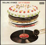
But, was his success just a question of good timing? Much has been made of his 1960s arrival in London with Bob Gill (one third of Fletcher Forbes Gill, Pentagram’s forerunner), just as the decade started to swing, and his approach to life certainly seemed to suit the decadence of that era. But Brownjohn’s serious, extra-curricular habits didn’t stop him from art directing ads and seminal posters, while producing film titles and designing for the Rolling Stones – in between popping out to catch Jimi Hendrix and, at the same time, featuring in a couple of films himself. His 2000-slide lectures of ‘unused ideas’ left a generation of designers permanently scarred. He was so well-known by 1967, that when asked to design some stationery for Michael Cooper (photographer of the Sergeant Pepper sleeve), he simply typeset, ‘Robert Brownjohn designed this letterhead for Michael Cooper’. You’d have to be pretty sure of your genius to do that.
Perhaps where Brownjohn is concerned, some of the mystique stems from his death. Just as the Hendrix/ Kurt Cobain/ Nick Drake/ Jeff Buckley brand of genius is concentrated in a quick burst of brilliance, crammed into a short space of time, Brownjohn’s output isn’t huge, but it’s all great. There was no time for a ‘quiet spell’, or a period spent art directing vast identities within a global branding concern, as might happen now. The high standard of his work has never been diluted by sub-standard fare and we’ve never had the chance to mutter those damning words, ‘of course his early work was better’.
If you ever wanted a good ‘BJ’ story, the first point of call was always his friend Alan Fletcher, so it’s especially apt that he’s designed this exhibition. Quite a posthumous honour, when you think about it – to have Mr Fletcher design your retrospective – but it’s indicative of just how highly Brownjohn is regarded. Go find out why. •
The Robert Brownjohn exhibition runs from 15 October to 26 February at the Design Museum, Shad Thames, London SE1. Robert Brownjohn: Sex and Typography by Emily King is published to coincide with the exhibition by Lawrence King, priced at £25
Michael Johnson is design director of Johnson Banks
-
Post a comment


