Eastbourne reveals new place branding
Mr B & Friends has designed the new visual identity for the south east town, which plays with sea wave imagery.
Mr B & Friends has designed a new brand identity for south coast region Eastbourne, which aims to dispel misconceptions that it is a “retirement town”.
The consultancy worked with tourist information website VisitEastbourne to conduct workshops with local people from industries including business, tourism, education and the council. This informed the town’s new visual identity.

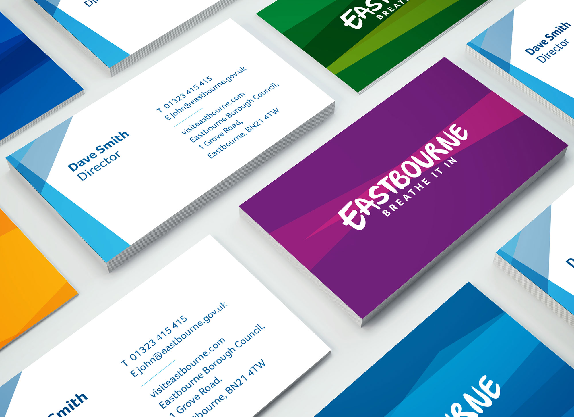
The place branding includes a hand-drawn style, sans-serif typeface, along with the strapline “Breathe it in”.
Kate Gorringe, creative director at Mr B & Friends, says the strapline was inspired by Eastbourne’s “breathtaking” qualities, such as the “sheer beauty, serenity, adventure and excitement to be found in this surprising town”.
The core colour palette is royal blue, pale blue, green and yellow, with the blue used to create a wave effect across the main logotype.
There is a secondary colour palette of different shades of green, orange, yellow, purple and pink, which create variations of the logo.
New advertising materials also feature photography of local scenery such as mountains and the sea.
Mr B & Friends says it wanted to create a “progressive” brand, and change “misconceptions that Eastbourne is a retirement town”, which has led to a decline in young people and families visiting or settling there, according to VisitEastbourne.
The new visual identity hopes to revive the town as a tourist destination, and draw attention to its leisure activities, climate and weather.
The project took 12 months to complete, and the new visual identity will begin to roll out across visitor guides, online, on campaign material and on physical place signage.


-
Post a comment


