
Amstel launches new global brand identity in bid for “coherence”
The Dutch beer company required a more united visual identity across its international markets, while also still adapting to local needs.
Dutch beer company Amstel has been given a new global brand identity by Elmwood, which seeks to create a more streamlined international appearance.

Amstel, which was founded in 1870 in Amsterdam, was bought by Heineken in 1968. It is now sold in 115 markets around the world. But as the beer brand has developed, a number of different expressions tailored to local needs have proliferated. While this approach has allowed a certain freedom for branding, it also meant that the international identity lacked a coherence.
Elmwood associative creative director Kyle Whybrow tells Design Week that: “While this approach has its benefits – local markets really know their audience – the brand was used quite flexibly and sometimes with a lot of license, which created a lot of inconsistency and a lack of cohesion over time.”
“One cohesive story”

“We wanted to bring this back into one cohesive story, that felt like regions could tell their story authentically but also feel like one overarching brand instead of different pockets of the same thing,” Whybrow says.
He likens Elmwood’s work to the NikeID customisation system, which gives users the ability to customise their own trainers using a digital tool. “It’s a tool where they can customise where they can see fit, and feel like they’re in control,” he adds. It also allows individual markets to see “very quickly” what works for them.
The design process involved a careful consideration of cultural context, Whybrow says. “We were trying to be respectful of what it means to have an Amstel in Russia, where taste is more expressive, versus in the UK where we tend to like more stripped-back minimal design.”
Refining a world-famous logo
With this in mind, Elmwood built a new strategic framework for the brand. It includes a set of assets for local markets to choose from in their branding, which allows for flexibility while retaining a visual coherence.
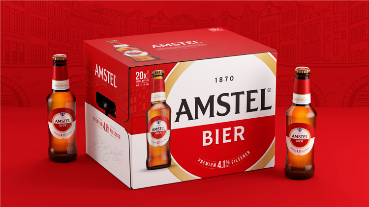
The heart of this new approach is a subtle refresh of the logo, which features a circle divided in half into red and white. Noting that the roundel is well-known – and ubiquitous in pubs across Amsterdam – Elmwood was keen not to change things too much. Instead the aim is clarity.
The shape of the logo and the colour have been “dialled up” while guidelines around its use have been clarified (there were around 30 variations of the logo, with different lock-ups and colour variations). “You can’t go too nuts with it,’ Whybrow says. “It was about being single-minded with that one overall articulation.”
“Story-rich archives”

To create the rest of the assets, Elmwood delved into the brand’s “story-rich archives” and searched for “what had historically made the brand distinct”. These visuals have been grouped under three “strategic” categories, which are tailored to different regions’ tastes: ‘Born from better beer,’ ‘Born in Amsterdam,’ and ‘Born from friendship.’
This part involved research into the brand’s history. The brewery had three founders; Charles Antoine de Pesters, Johannes Hendrikus van Marwijk Kooy and Willem Eduard Uhlenbroek. De Pesters and Van Marwijk Kooy were brothers-in-law. This backstory inspired the ‘Born from friendship’ group.
The founders aimed to produce a beer that was as high quality as its German counterparts, which inspired the ‘Born from better beer’ category. While it was primarily drunk by people in Amsterdam, it expanded to outside the country with the expansion of the Dutch railway network. The brewery itself is named after the Amstel river in the Netherlands. This was the foundation for the final group.

Illustrations and visual assets were created from this heritage, relating to the three categories. These include signatures from the founders, “distinctive” architectural details from the original brewery and period-authentic coins and medals. “All these little details were lovely and rich for us to bring to life,” Whybrow says.
How have regions engaged with the branding?
Different regions have engaged with the three categories for their respective branding. Whybrow says that China is more invested in the friendship-based imagery, while somewhere like Spain focuses on the details of brewing technique.
The UK likes “bold” and “simple” which leans into the graphic details and typography. However, Russia likes to “dial up the illustration and craft story”. “We felt like we were covering different regions which feel more authentic to them,” Whybrow adds.
According to the designer, around 20 territories have engaged with Elmwood about “refining” visual assets for their branding. Assets can be used flexibly across these groups; there is no need for regions to simply pick one group and only use imagery from that. For example, the founders’ signatures are popular across multiple markets as a sign of heritage and quality.
Read this next

-
Post a comment


