Cast against type
Quentin Newark of Atelier Works thinks that graphic designers can still learn a lot from the precise art of letterpress typography
Marshall McLuhan, high-priest of the typographic community, said: “Each new technology creates an environment that is itself regarded as corrupt and degrading, yet the new one turns its predecessor into an art form.”
Computers have, within a shockingly short time span, knocked any other way of making typography into a cocked hat. Gone forever are the days of marking-up, and waiting for the bromide galleys to arrive back the next morning, still warm, from the photosetter. And if we wonder at how we had the time in those days, just imagine a time further back when type had to be individually plucked by hand from a tray and slotted into a forme, then taken into a press, inked and printed, before it came to you. (It reminds me of my dad telling me about his first job; delivering milk in fat bottles with cardboard lids from a horse-drawn cart.)
What McLuhan did not say was that if each new technology turns the one before into an art, it turns the one before that into a craft. By the early 1990s, letterpress had sunk so low it warranted an exhibition at the Crafts Council. Colin Banks, in the introduction to the True to Type catalogue, hoped the few scattered letterpress practitioners might find a market of “discriminating readers” for carefully made books. These benevolent few have been better described as “print-pilgrims”, a strange mix of printers, designers, fogies and US investors. Is this charity really the best hope for a design activity practised continuously for 500 years?
In 1964, one of graphic design’s seminal texts was produced by printer/ designer/ teacher Anthony Froshaug: a booklet called Typographic Norms. This modest publication is a kind of manifesto for letterpress. Three years later he wrote an article for Designer magazine in which he articulated his ideas. The key sentence is this: “The word typography means to write/ print using standard elements; to use standard elements implies some modular relationship between such elements; since such a relationship is two-dimensional, it implies the determination of dimensions which are both horizontal and vertical.” The booklet explores this idea of standardisation, showing the spaces, bodies, the relationships, the constraints and rules that operate inside the bed in which letterpress type lies. “Acknowledge all constraints,” says Froshaug, by which he means: understand the nature of type and the way it got that way.
Back in 1990, Octavo, the Tomato of its day, called for a rejection of “letterpress-derived-dead typography and all its attendant convention”. This is both one of those mini-statements that is initially thrilling (like declaring “the death of print”), but on reflection seems increasingly foolish and insubstantial. Almost every typeface in use today was first designed and cut for use in letterpress (including Octavo’s favoured Helvetica). Many of the new, funky, wholly electronic fonts go back to 15th or 16th century examples. Type is still designed on rectangular bodies, bodies that hold the letterforms in an invisible frame separate from the letters next to it and above and below it. Many of these conventions have been carried into the typography of our computers; the skeleton and structure of ethereal 21st century digital type is still firmly physical. The language betrays this: points, upper and lower case, baselines, even the word typeface refers to the “face” that is presented to be inked. The conventions developed during the centuries of the letterpress era are so embedded in how type has been developed that it is impossible to separate type from the process that created it.
What has spelled the end of letterpress is its labour-intensive process: it is unrelentingly real. It is also slow, fiddly and unforgiving: if your figures are inky that pull is ruined. Every single decision has to be considered, planned, and then acted out, all in reverse. The sheer physicality is what puts designers off, it seems so impossibly slow and complicated, and to engage in it you would have to transform yourself from being a mind-worker to being an actual worker. That, and also that you have to know before you start what you are going to do, you cannot just switch fonts, or try it half a point larger if you have spent an entire day composing. The whole nature of letterpress type is fixed, immutable, in a way completely opposed to type from a computer: it can not be shrunk or stretched. You can change the type by physically cutting or scoring it, but unlike the virtual world, where command Z restores it instantly, in the actual world it stays damaged.
But perhaps it does have something to offer. We are so dulled by the machine aesthetic, by the startling ease and speed it does things, by its flatness. We are so used to multiples that bear no relation to human energy, to print runs in the hundreds of thousands, millions even, to zapping what we refer to as “artwork” down telephone lines.
In letterpress, every action you make has an effect, if you ink thinly it prints thin, if you bleed the colours it prints that way. You can see the dust from the paper swirling in the sunlight, you can hear the treacly crackle as you ink the roller, you reel at the smell of the turpentine. Each little piece of type you ink bites itself into the paper. The surface of work printed by letterpress undulates minutely; the type sinks back, the ink has a sheen. Each print differs, even if only by tiny fractions, from its fellows, it is typography that has clearly and definitely been made by painstaking, and varying human effort. We forget that letterpress is as close as graphic design ever comes to the production of something unique.
Every designer and typographer has to use type. Froshaug said: “Typography is a grid”, and this is nowhere more apparent than when you use type that is physically manifested as elements of a grid. It does not need to be trapped by that grid, but the grid must be understood and worked with. Pentagram partner Michael Bierut once said, “Some designers fill in their educational gaps as they go along, some just fake it.” Whichever way you feel your instincts pulling you, to understand how type got to be that way and use it well in that tradition, or to flout convention and release type from the forme to develop in new ways, the start point is an understanding of the process and history of letterpress. “Admit constraints,” says Froshaug. “Then, having admitted, fill with discovery.”
The following typographers illustrate that there is not one single, orthodox way to incorporate letterpress into typographic practice. They are a fairly random sampling and show that this centuries-old tradition, while not as common, is as alive and vigorous as it ever has been. The Apple Macintosh we all use to do our typography is only as good as the programmers make it. It does not have any inherent values, because it does not have any constraints. It will do almost anything you want, except produce automatically good typography. Jan Tschichold said: “The greatest benefit of looking at good work will always be gained by those who study its finest details and subtleties.” The disciplines of letterpress have much, still, to teach us.
Alan Kitching
It is unthinkable to review letterpress and not mention Alan Kitching. He is the Guvnor. Recently, his technique has been changing, becoming looser, driven by the practicalities of running workshops in Düsseldorf and Copenhagen, at art colleges not in possession of presses. He takes a small bag with some type, an apron and some elastic bands. He gives the students a simple organising idea, what he describes as “a word or source of words, like © Jonathon Green’s dictionary of slang”. They sift through the limited type, and compose words or clusters which are held with elastic bands. To avoid the paraphernalia that comes with ink, Kitching uses a variety of substances to make the type ready for the paper, most often gouache paint. The print is made by rubbing the paint on to the type with whatever can be found, a roller if he has packed it, or a spoon from the canteen. This improvised – and hugely popular – workshop reduces the process to the absolutely essential actions of letterpress; planning, preparing the type and making the print. It’s a rush for students, typography in half an hour, a speed that competes with the Mac.
A good example of the outcome of these workshops, which took place at the Royal College of Art, is a word-picture: Stonkin’ by Madeleine Duba. The letters are from some kitsch Victorian font that would be unusable in any conventional setting, and Duba has printed them in lurid pink, exploding the “O”, making it a dancefloor stomped excited exclamation, or perhaps a crude, bellowing mouth.
The energy and improvisation of the valise-workshops has fed back into Kitching’s everyday work. He is composing more quickly with what comes to hand, inking more randomly, dabbling and laying down the ink unevenly, allowing colours to bleed: it is all more intuitive. Using the true sense of the word, you could call it impressionist.
He is expanding his work spaces, setting up a new venture with designer Celia Stothard. In her atelier in London’s Kennington, they are installing a workshop and gallery under the banner The Wordworkshop Gallery. It will show Kitching’s work, and work from other letterpress typographers.
Kitching has a regular weekly job that suits this more relaxed method, a map for the FT’s the Business magazine’s restaurant review. He only needs to do one print for the FT, but he does a dozen just to warm up, picking the best, selling another one to the restaurant. The map is naturally fitted on to the grid of the type, right angles, streets abutting, tube stations are a zero, the restaurant marked with a pi character. Where he starts using a partial font, as in the name Charing Cross which had no “C” and no “G”, he substitutes letters from another font. The effect is like the architecture of London itself, mismatched, added on, jostling.
Another piece is Snakes and Arrows, an illustration for Real Business Magazine about the benefits and pitfalls of high risk investment. Kitching’s black arrows stab upwards through the fat bubbles of money, and you feel they will inevitably peak, and then slither down and vanish.
Phil Baines
Phil Baines and his compadre Catherine Dixon teach the typography component at the Graphic Design degree at Central St Martins. He has just dragged, or had students drag, all the letterpress equipment up from the basement into his studios on Long Acre in central London and prepared it for daily use. Every student will study letterpress as part of their first-year course. So a whole new generation will learn to compose. Baines says that hot metal is “not old, or the way it used to be, but just another way of doing typography”. He firmly believes in the careful study of type’s history, or as he puts it “learning more and different things about type”, and is withering when it comes to the lazy, “default” typography composed in the Mac’s “electronic cloud”. It’s harder than most designers realise, he says, the software writers for the Mac have not got all the standards right, and “good typography is not easy and it’s not automatic”.
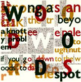
His own work is a particular result of this study. He always starts by seeking some kind of mathematic logic in the words. This is particularly clear in Wood Words, a poster for the Crafts Council and Common Ground for an exhibition called Out of the Wood. Amid the forest-coloured mass of letters, you can just determine the nine letters of Wood Words, each centred in a square. These give the poster its © shape, and its grid, and all the other type is sized and positioned by the logic these first letters provide. Or rather, the logic Baines makes them provide.
Another piece is based on the practice of inscribing into stone. The Romans painted a grid of squares on to the stone, to position the letters, and Baines does the same on paper, each square marked by a letter of the word inscriptions. The text extracts and quotations are then “logically” run within this grid, building a kind of commentary, oldest quotes smallest, most recent largest. Baines and the inherent grid of letterpress are made for each other, you feel Baines would have invented hot metal setting if it had not already existed.
Eiichi Kono
Eiichi Kono studied under Herbert Spencer and then the remarkable stonecarver and calligrapher, David Kindersley, by whom he was deeply smitten. Deeply immersed in all careful, conscientious ways of making typography, he was one of the founding members of the International Type Associates: “each with a different skill, like the X-men”, supporting Susan Shaw’s super-human effort to build a Type Museum in London’s Stockwell. This museum will eventually house 8m pieces of type and printed samples, it will have working presses, casters, and, as well as educational workshops, it will be able to carry out commissioned work.
Kono approaches letterpress from an interesting angle. Obviously, in Japan there is a great tradition of calligraphy, one far longer and far deeper aesthetically than their comparatively recent mechanical typography. This is why he was so struck by Kindersley and his artist-like creation of unique letterforms. But he has gone on to bring this sensitivity into his own work. His book on Kindersley is meticulously crafted, and exhibits some of his efforts to apply letterpress standards to Japanese alphabets for Microsoft.
Phil Cleaver
Phil Cleaver produces several jobs using letterpress as an economic alternative to computer setting and off-set litho. He happily flits between the Mac and hot metal, using whatever the job schedule dictates; he uses “letterpress aesthetics”, or “good values” in all his work. One of the Type Museum’s X-men, he won a British Design and Art Direction silver for the Museum’s stationery.
Cleaver was taught by Froshaug, whose tastes and rigour are still very apparent in his student’s work. An impressive example is a copy preparation and proof correction guide. It maps a fast disappearing language, the red squiggles and curliques that used to unite compositors, typographers and proof readers, the language of typographic and linguistic rectitude and precision. Set in Froshaug’s favoured font, Gill Sans, and in exactingly tiny six point, it is a model of clarity and formalistic beauty.
Ian Chilvers
Yet another of Susan Shaw’s X-men, Ian Chilvers recently set every street sign in London’s Stockwell, one of Lambeth’s “villages”. He used Albertus, the distinctive, chiselled humanist type cut by Berthold Wolpe in 1932, chosen because Wolpe lived in Lambeth. Although the type was generated on a computer, the spacing was done by exhaustive reiterative individual letterspacing (I know because I saw him do every one). The phrase he uses for the benefits of understanding the type’s invisible grid is “a certain sensibility”, and the knowledge provides “an energy to be more careful”.
He is involved in producing materials for the Type Museum; broadsheets on numbers and letters for children, and these pretty postcards, passing on the wisdom of great typographers of the past. Chilvers’ Stockwell sign commission came from the Type Museum, and it’s hoped that the sensibility can reach out, radiate from the much-loved type trays and presses of the Museum, improving typography everywhere. n
-
Post a comment


