Sanatogen revitalised by Ergo pack design
Brand specialist Ergo has redesigned the Sanatogen range of vitamins in response to increasing competition in the health supplements sector. The move follows research revealing that Sanatogen has lost on-shelf presence due to increasing fragmentation of the market.
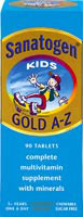
Working closely with consumer health teams at Sanatogen parent group Roche Products, Ergo has replaced the former conflicting colourways, including gold, silver and maroon, with an upbeat and consistent sky blue colour across the whole range.
It has also introduced a new “life-belt” circular logo to each vitamin range, from Sanatogen Gold A-Z to Baby Syrup. These feature images of people in lively poses to make the on-pack information more digestible.
“The new ‘Sanatogen World’ logo acts as a focus for information about the product, telling consumers what they need to know in a simple, efficient fashion,” says Ergo partner Simon John. He says vitamins are merchandised by type rather than brand, and therefore have to work even harder on-shelf to attract consumers’ attention.
The new look will be rolled out later this month.
-
Post a comment


